Project information
- Overview:A cross-platform application designed to help caregivers organize and vocalize care for those in need.
- Team: Myself (sole, lead designer), CEO,Dev lead, Business Management Lead.
- Duration: 6 Months
- Problem: Managing care for someone undergoing hardship is both time consuming, emotionally draining, and overwhelming.
- Business Objective: Drive sales to purchase care items.
- Goal: Provide an experience that makes administering care joyful rather than painful.
- Metrics: Completion of core tasks based on existing problems.CSAT ranking for each flow, goal of 8 ranking or higher, with pass rate higher than 80%
Understanding the Problem
Before I began designing, I first had to understand the pains users were going through in their care journey. I conducted five contextual inquiries to gather demographic data, goals, and where it hurts most. Qualitative data was compiled and compared in a spreadsheet, and then I found where the overlap in emotion existed between several people. Here are a few trends that were discovered.
Caretakers have their hands full
... and need help, too.
The initial business assumption was that caretakers would be the primary audience. However after digging deeper, I uncovered that close family and friends were the most engaged in providing assistance. The people who needed the most help, were those doing the helping.
Privacy is key
"I wouldn't want anyone to be able to lookup my daughter..."
Another assumption going in was that people should seek help from their communities at large. Primary caretakers preferred to keep this within their "inner circle".
Those in need don't know what they need
... and are often too afraid to ask
Chalking it up to a sense of pride, many caretakers and survivors didn't know (or didn't want to ask) for what they needed help with. The expressed a slight shame in asking others for help, and didn't know what to ask for specifically.
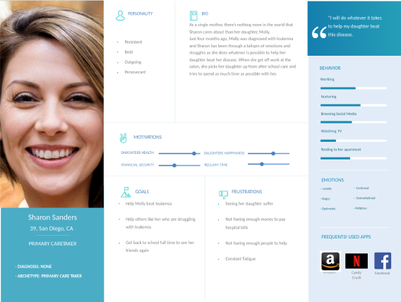
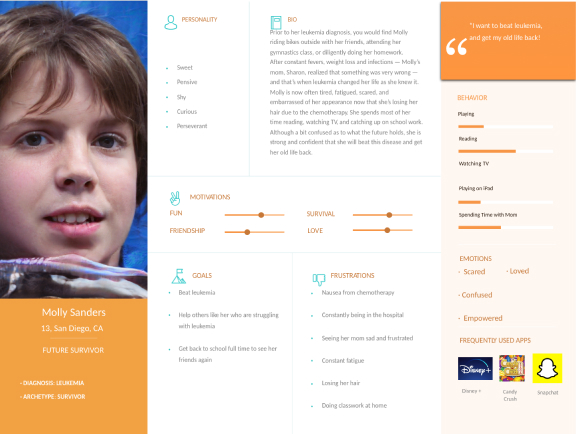
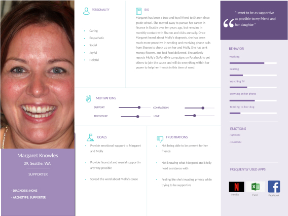
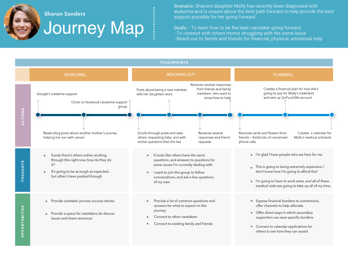
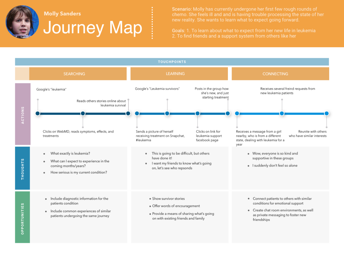
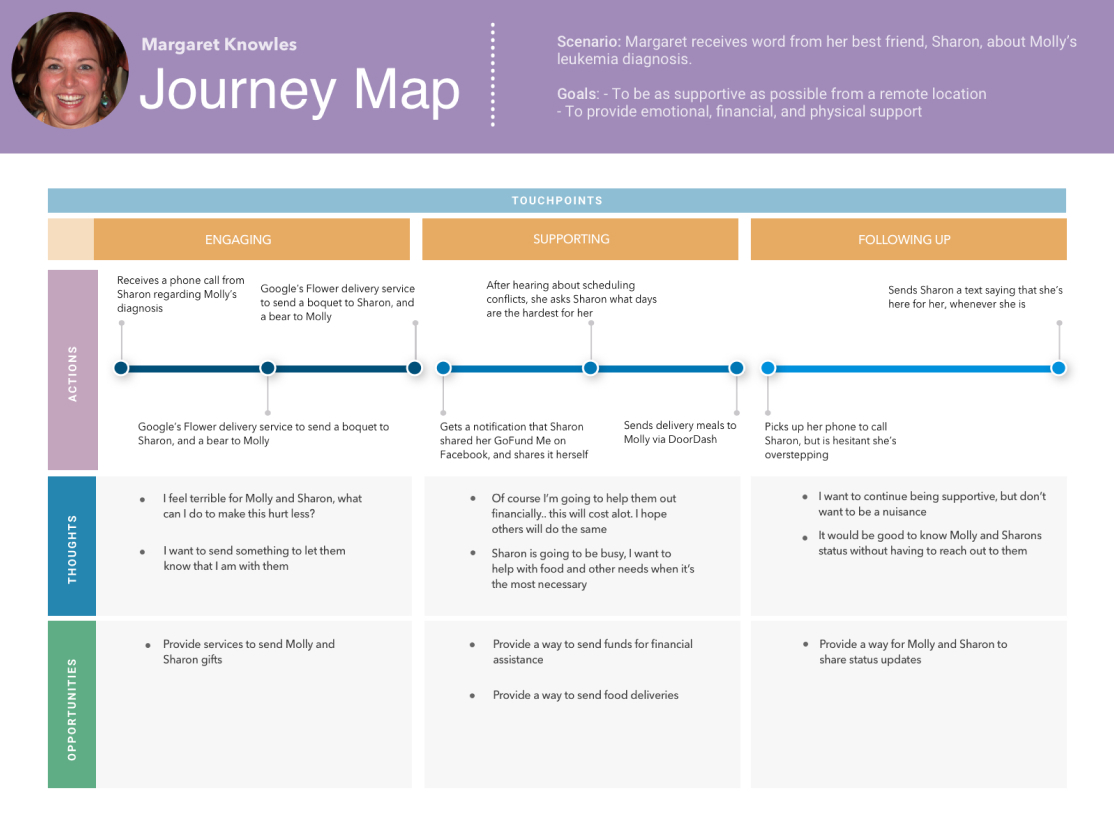
Personas & User Journeys
After solidifying these trends, I was able to compile personas, the key actors in the care story, to help us identify who we were tackling problems for and why. Journey maps were included as well to show what the typical care process looks like in the real world, so that we could identify ways to fill the gaps in the existing, painful process.
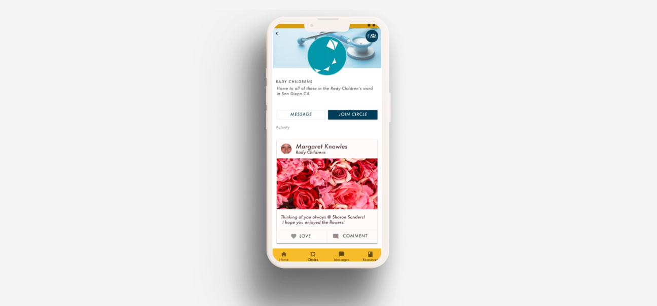
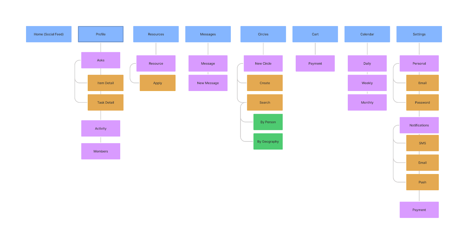
Information Architecture
Based on groupings of key problems from the initial conversations with target audience and a competitive analysis of existing core offerings from competitors, I came up with the following information architecture.
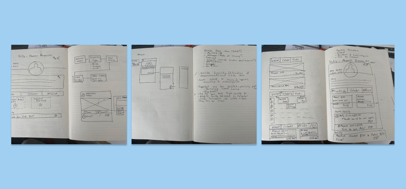
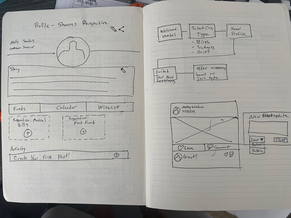
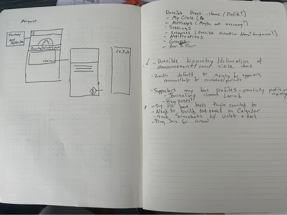
Lo-fi and Brainstorming
Several whiteboard sessions were conducted to collaborate with business leaders and developers to ensure that we were: 1. Solving the users problems 2. Addressing key business needs (selling care products) 3. Developing an app that is feasible for a small development team with a tight timeline. Wireframes were created for us to quickly suss out any internal problems with my hypothesized flows early.
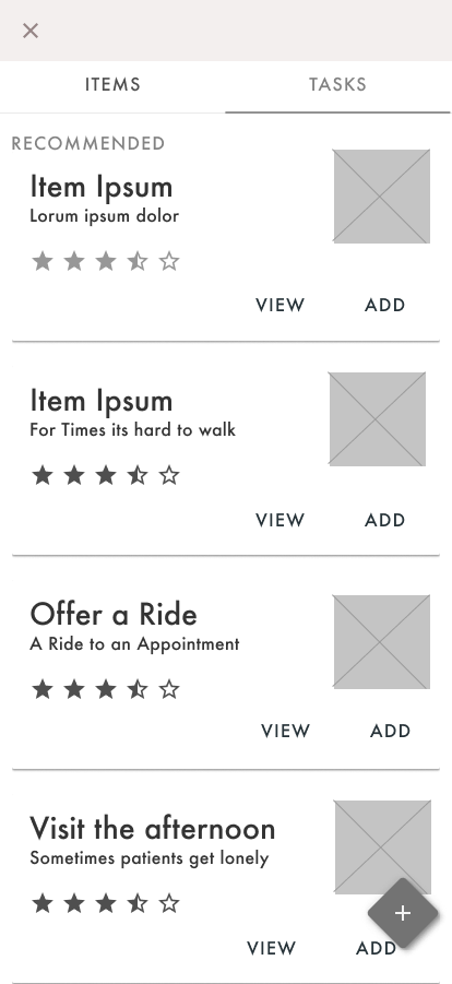
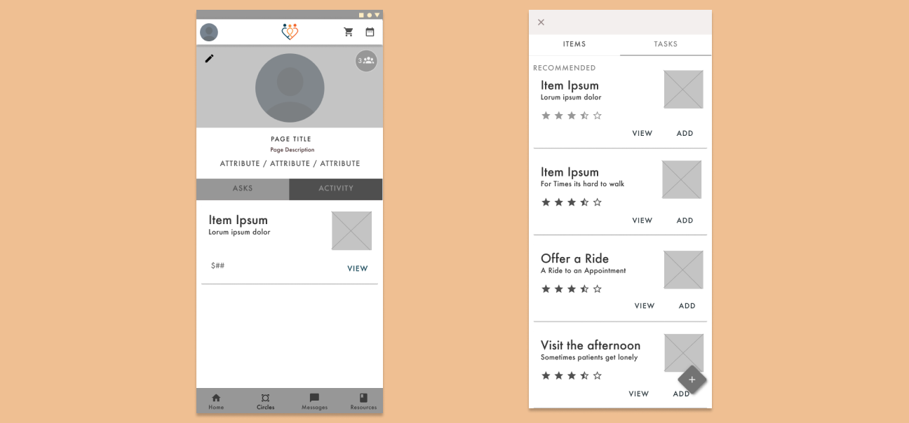
Visual Design
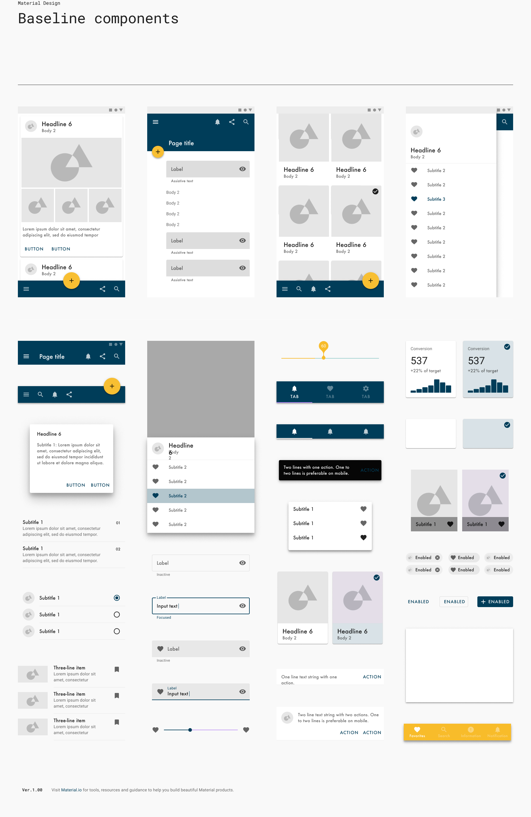
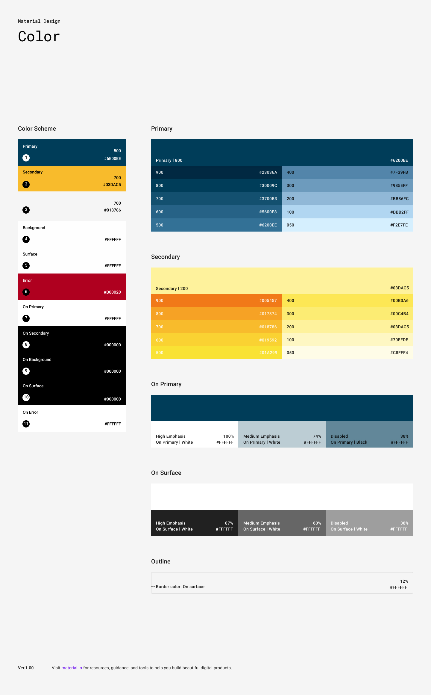
For font I went with Futura and Futura Book, which struck a professional yet friendly balance, fitting the mood of this app. Colors were spawned from a mood board session. The tone conveyed was "bright" and "calm", so an orange/navy complementary scheme was born from the concept of a sunset over the ocean, which evoked this feeling. Components were then created, tested and adjusted for contrast and accessibility.
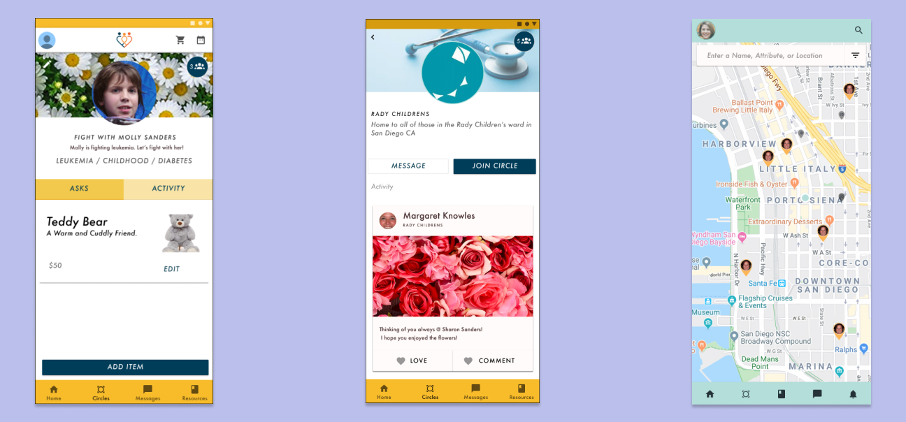
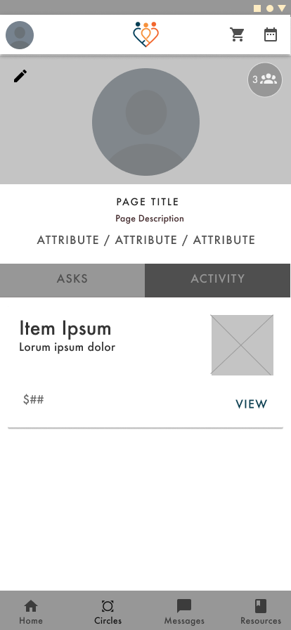
Hi-Fidelity & Usability Testing
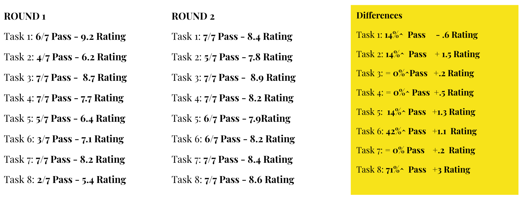
Next, the veneer was put in place and the prototype was built, confirmed, and tested. We came up with 8 key core tasks that our users would have to be able to do in order in successfully use the application and accomplish key business objectives. These flows were tested in 2 rounds of testing across 7 users, looking for pass fail rates, and capturing qualitative data.
6/7 Failed to Navigate
I was quickly reminded why icon only navigation doesn't work, as 6/7 users were unable to knowingly navigate to the "My Circles" or "Resources" pages.


5/7 Didn't Understand the Difference between "Home" and "Profile" pages
There were many visible similarities between the home and profile pages, causing users to become disoriented as to which page they were looking at. Adding more differentiation and visibility into which page is being visitied eliminated this problem in the second round.
3/7 Voiced Relying heavily on external scheduling tools
Further integrations were added to the final design to allow users to live in the tools they currently use most.
Reflections
-
Earlier Testing - Testing at lower fidelity would have been more desired to reach high level conclusions. Constraint because stakeholders wanted to present polished product to users.
-
Continuing research and iteration after launch - Project was a handoff after design. In an ideal scenario, would have been great to capture metrics around successful task completions, time on page, impressions, etc.
-
Large Scope - When too many personas are at play, the experience gets muddled for the key users in focus. Pushing harder to limit personas would have yielded a more focused experience.