Project information
- Overview: Instant Checkmate is a web-based background check service that allows anyone to search for someone to uncover arrest records, and other indicting information.
- Team: Myself (sole, lead designer), Lead Developer, COO.
- Problem: The sole way the company was understanding its users was through analytics, leaving a void in understanding of who their users were, what they wanted, and what prohibited them from reaching their goals. The team was struggling to innovate new ways to obtain and retain users.
- Business Objective: Drive users to purchase a full background report
- Goal: Create an experience that allows users to navigate a background check with ease.
- Duration: 8 Months (2014)
- Metrics: Increase in Conversion rate via A/B Testing and less reported support calls.
Understanding the Problem
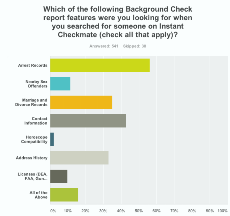
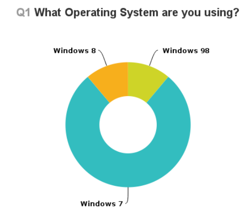
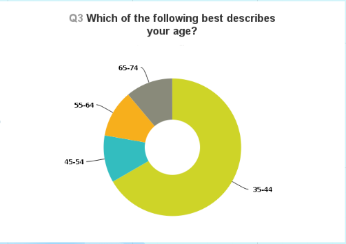
We already had thousands of users, but didn't exactly know who they were, or what their motives were for visiting a background check site. I coordinated with an email marketing team member to compose a SurveyMonkey email blast to our current registered customers. This was to get a good high-level idea of our user demographics.
Contextual Inquiry
To talk to some real users of our site, I used a screener on the home page of our website that captured participants willing to chat with me for a giftcard. Once people signed up, I immediately called them and began a screen recorded session to have them walk through and think aloud regarding their existing experience. I did this with 40 users.
Personas
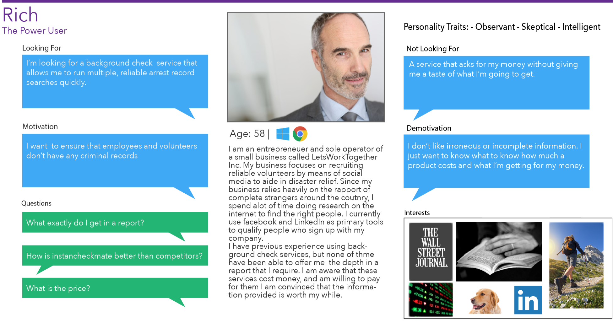
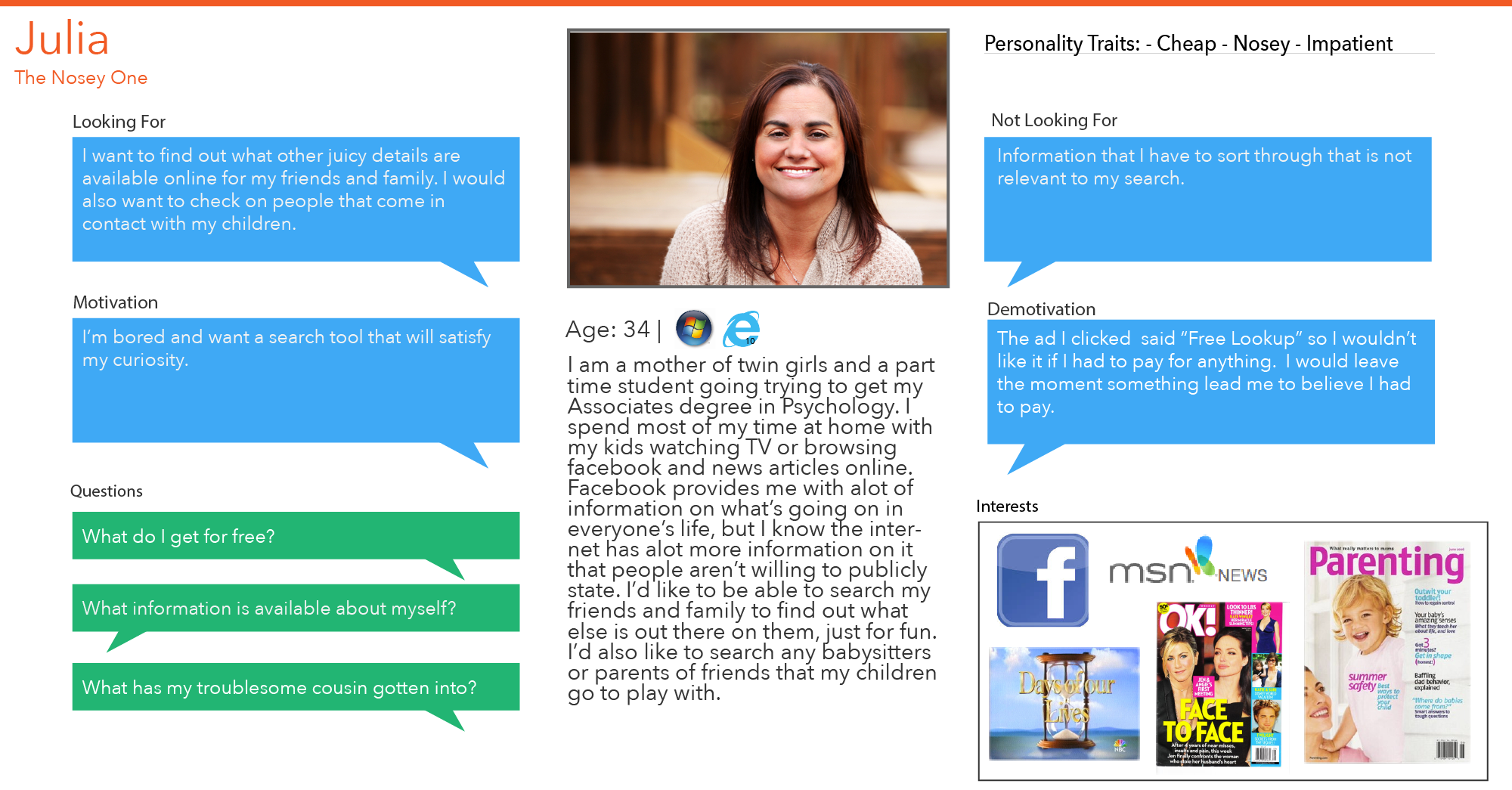
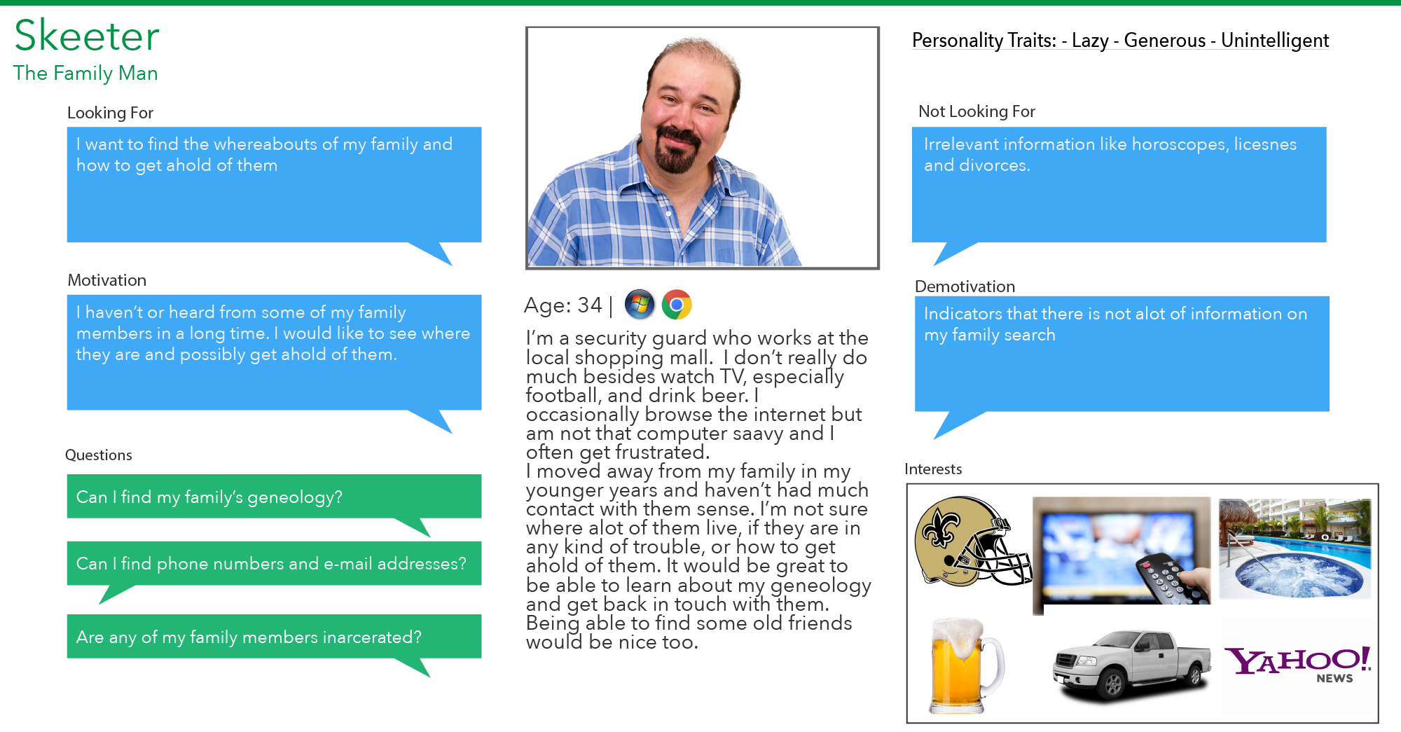
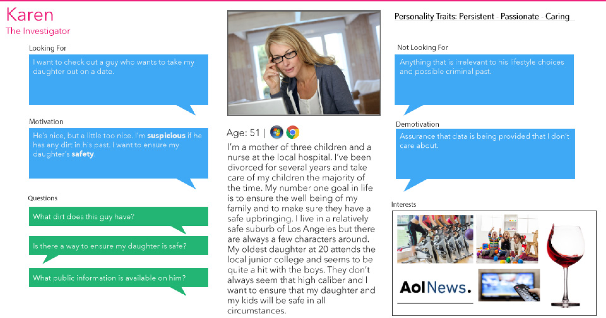
After identifying trends in user goals and pains in their day to day business, I created personas to represent our users and their key motivations for wanting a background check.
Affinity Diagramming
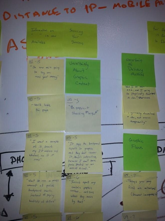
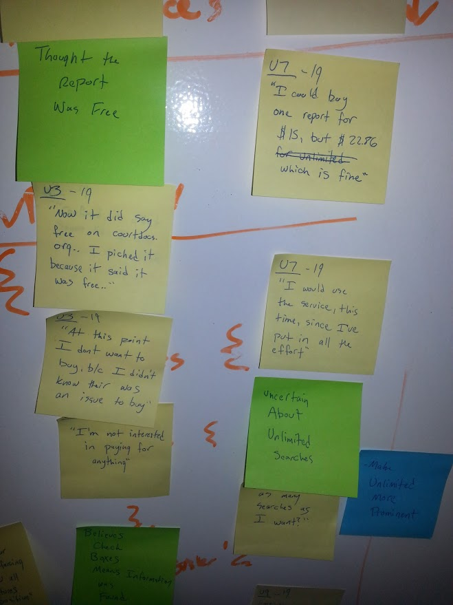
After transcribing all of my comments, cognitive phenomena, ideas and observations into sticky notes, I hosted a week long session of affinity diagramming sessions to create what was known as "the wall" to figure out what were the key needs and pain points our users were having. After that, I then did a trend analysis on all of the groupings from the diagram.
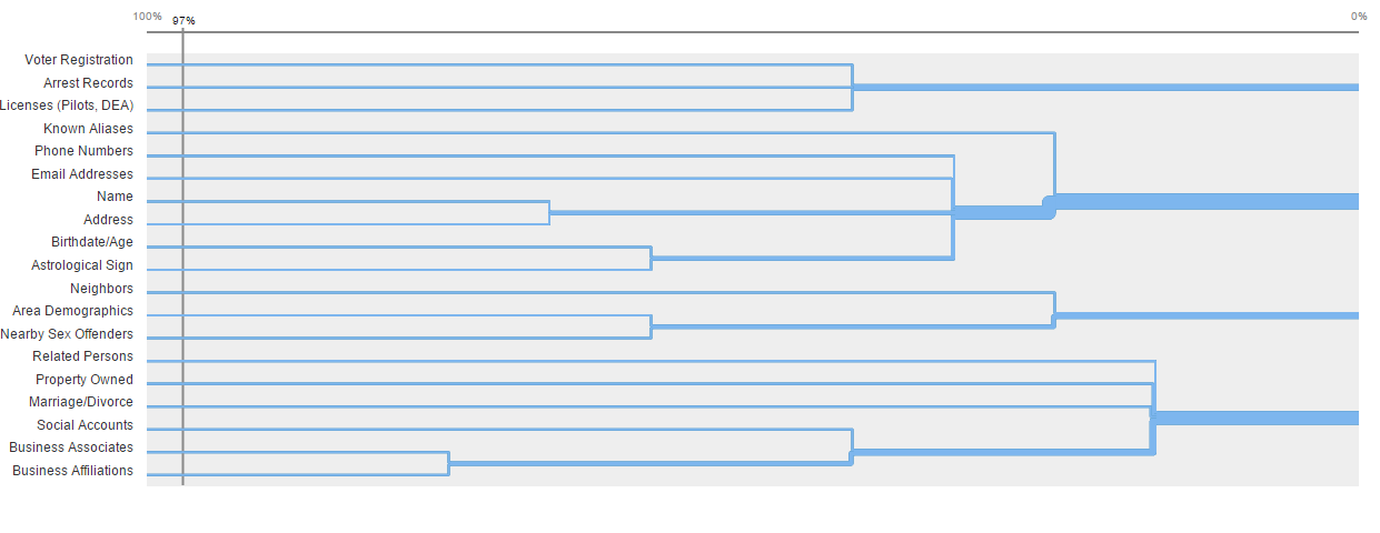
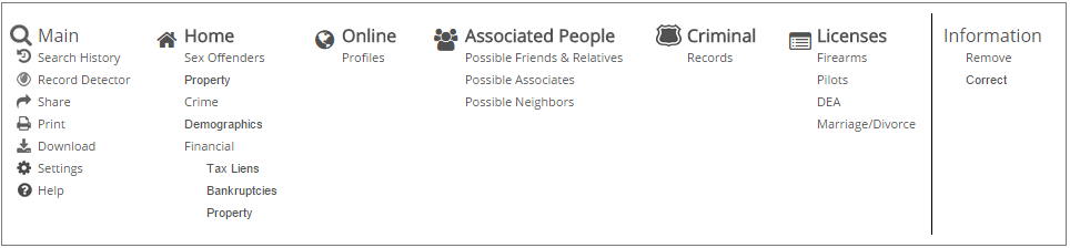
Information Architecture
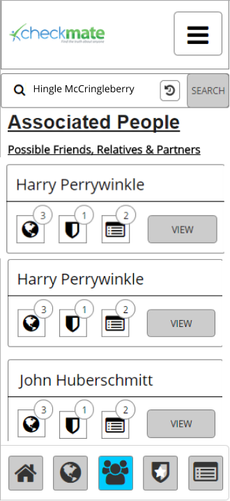
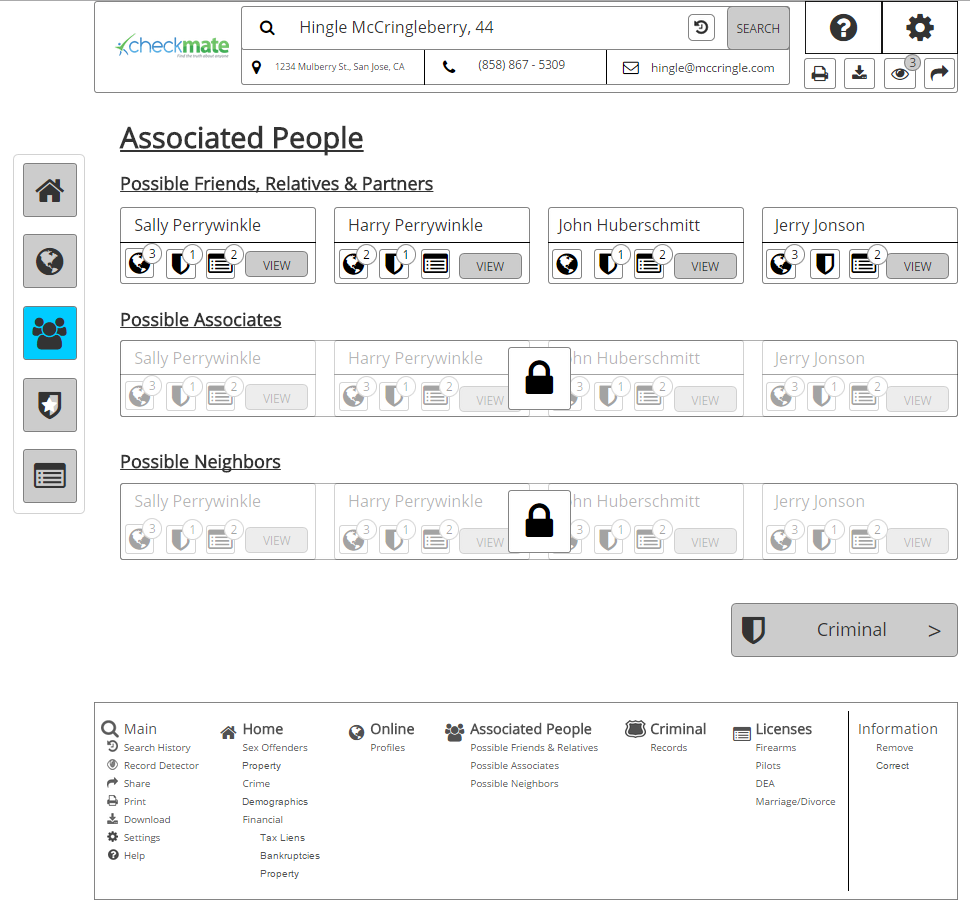
To determine the best information architecture for the application, I recruited more live users for a virtual card sort study. I was able to find some key groupings that users believed to be the most logical organization for the existing content of our site, and used that to compile the information architecture.
Sketch + Collaborate
Sadly, many trees were sacrificed in the name of user experience to get this design to a state of my liking. I sketched out ideas with developers and the COO to make sure that I was aligning with development constraints and capturing the key points that the business wanted to drive home.
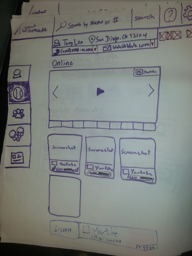
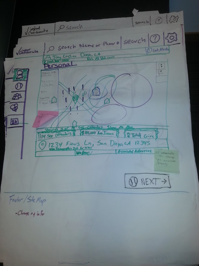
Lo-fi + Testing
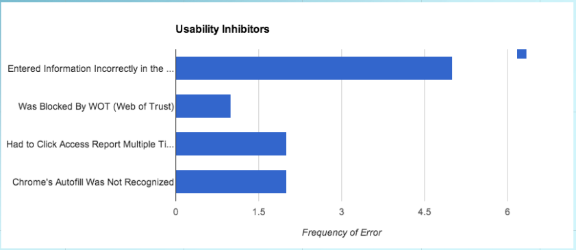
I digitized my sketches into more formal, low-fidelity wireframes and prototypes. I prototyped at this stage so that I could again test with users to ensure that they were able to seamlessly navigate through the app and were quickly able to absorb the information they were most looking for. I compiled my data into a spreadsheet, and identified several bottlenecks at an early stage, notably:
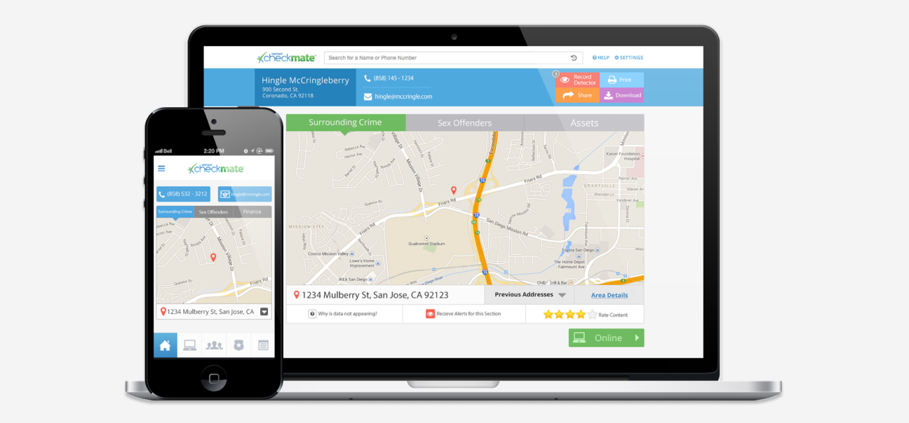
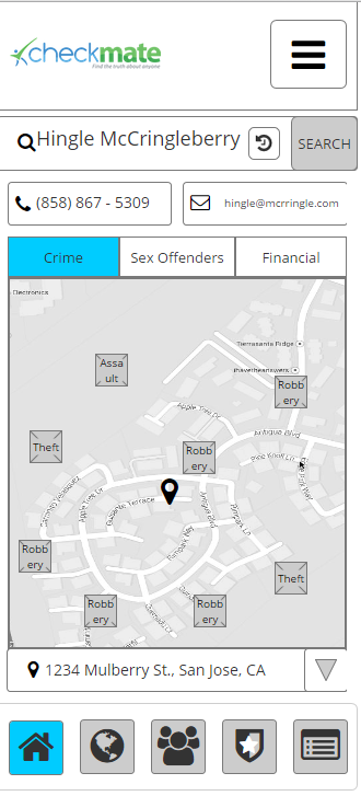
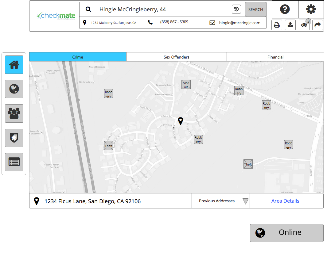
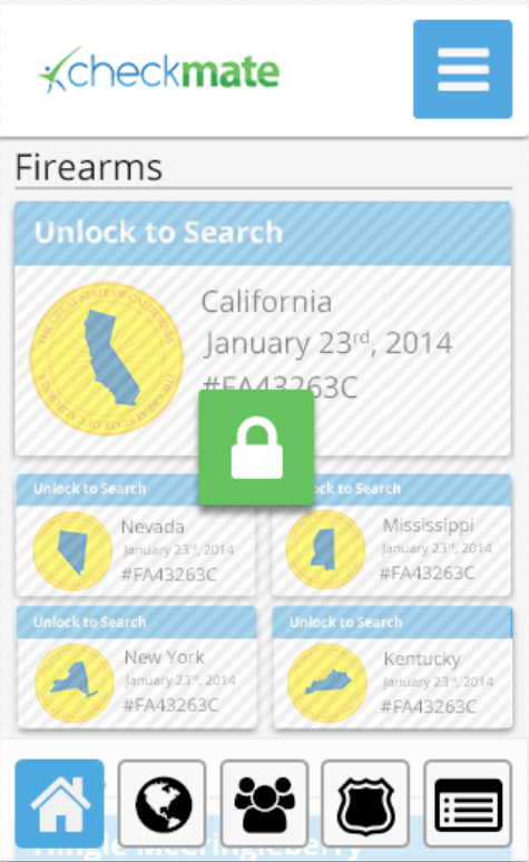
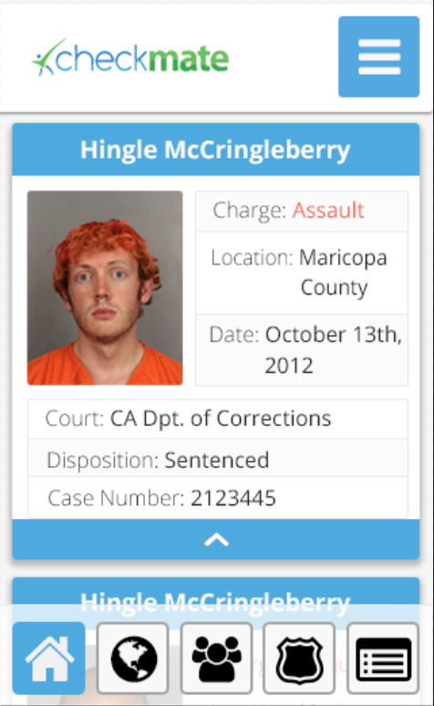
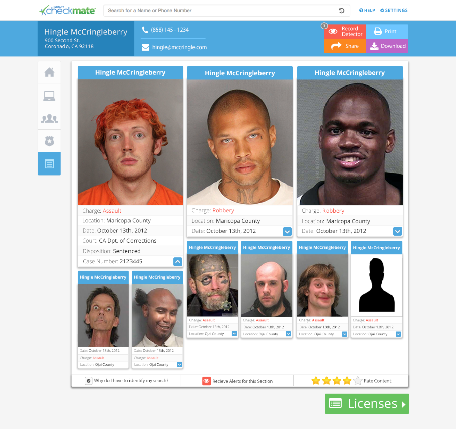
- Users weren't sure why they were looking at surrounding crime, sex offenders, and financial statistics upon opening the site. This was a business decision that ultimately ended up staying (because the data was free), but was worth noting.
- Most users were first trying to establish trust with the site, and therefore were very curious about what information existed on the internet about them. This lead to major changes in the funnel leading up to purchase and changed designs going forward.
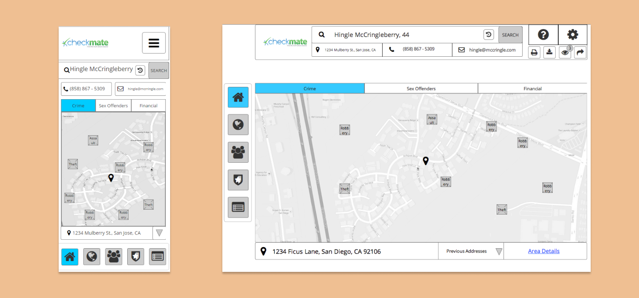
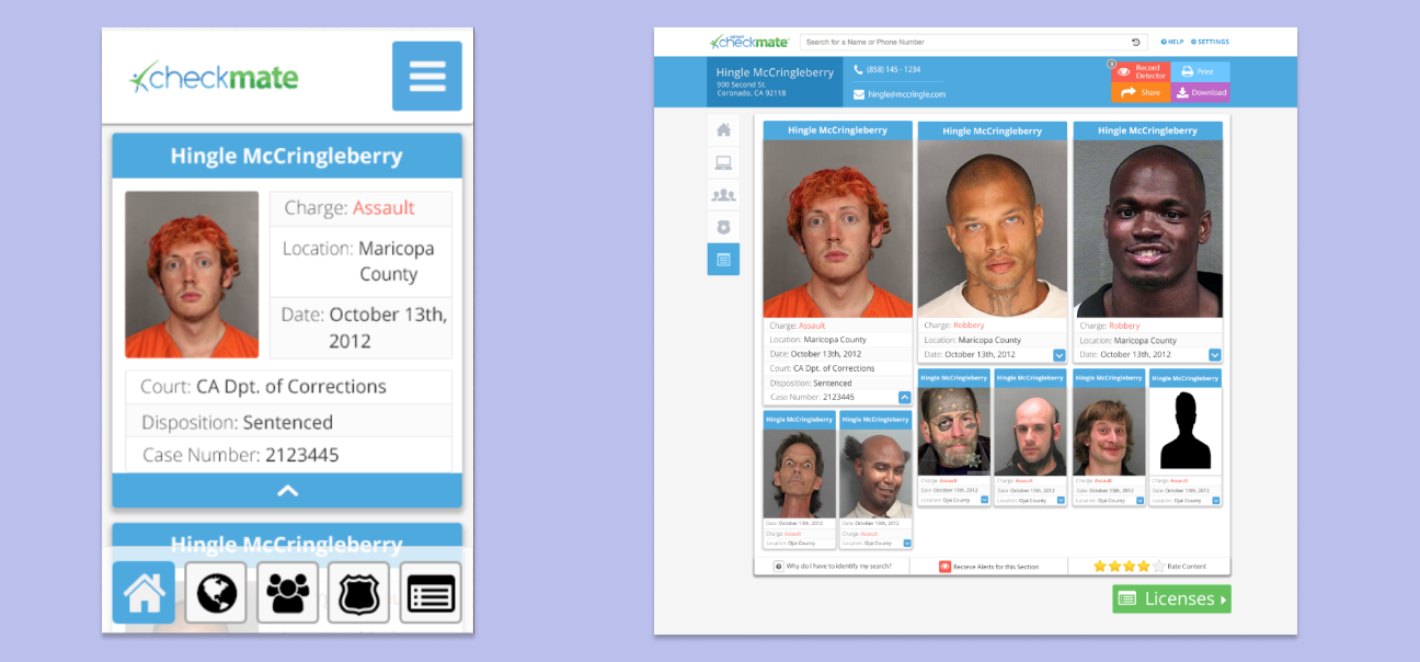
Hi-fi + Testing
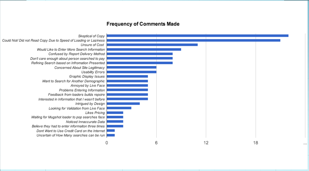
I then added the aesthetic layer to draw attention to desired interactions. Another round of testing was composed letting users navigate through the site for their intended purpose and using the "think aloud" method to capture insights. Some interesting data points that arose were:
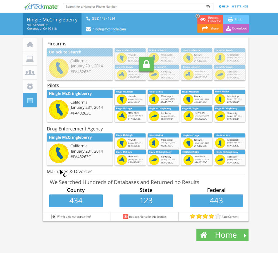
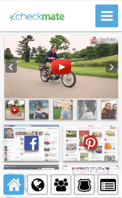
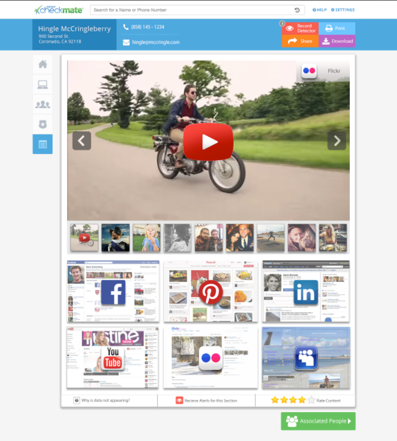
- General disorientation about what information was being presented, and how it related to the funnel that conveyed what they were going to see
- Confusion about where or how to navigate to other pages. (Tooltips were later added to the menu, and a "Next Page" button was added to the bottom of each page to remedy.)
Results
The design proposals were all phased in and rigorously A/B tested. The result yielded over a 40% increase in conversion rate (Over 8 Million MRR). Further user tests confirmed a great decrease in frustration, and the customer support call center claims they had noticed a significant decrease in phone calls and negative reviews.
Reflections
-
Mobile Testing - Due to the remote and immediate nature of the testing I had available, I was unable to test on mobile, which would have been very useful given that around 50% of our base was on a phone.
-
Affinity Diagramming - Is an excellent practice that I plan on using more of whenever possible. It included the team to make the process more democratic, and exposed developers and key business leaders to physically engage with user data, and develop empathy.
-
Virtual Card Sorting - This was my first time doing this exercise virtually, and although there was quite a bit of bunk data to sort through, the volume of responses that I got yielded to some great data that helped us organize the information architecture of the site.