Mobile UX · 2020 · Sole, lead designer
A cross-platform app that helps caregivers organize and vocalize care for those in need — turning a draining coordination problem into something closer to joyful. I owned design end to end across a six-month engagement, from contextual research to a usability-tested high-fidelity prototype.
Family Proud is a cross-platform app that helps caregivers organize and vocalize care for someone undergoing hardship. Managing care for a person in crisis is time-consuming, emotionally draining, and overwhelming — and the business had a real objective riding on solving it: drive sales of care items by making the experience worth coming back to. My goal as the designer was to make administering care joyful rather than painful.
I was the sole, lead designer, working alongside the CEO, a dev lead, and a business management lead over a six-month engagement. We agreed on a measurable bar up front: every core task should hit a CSAT ranking of 8 or higher, with a pass rate above 80%. That gave me a scoreboard to design against instead of a matter of taste.
Before I designed anything, I needed to understand the pains people were actually living through in their care journey. I ran five contextual inquiries to gather demographic data, goals, and where it hurt most. I compiled the qualitative data in a spreadsheet, compared it across people, and looked for where the same emotion surfaced again and again. Three trends reframed the whole project — and each one overturned an assumption the business had walked in with.
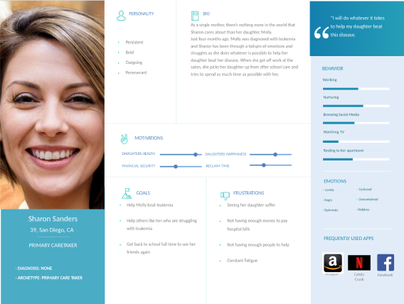
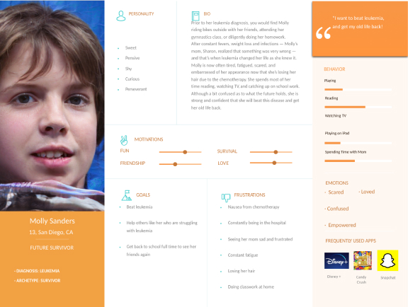
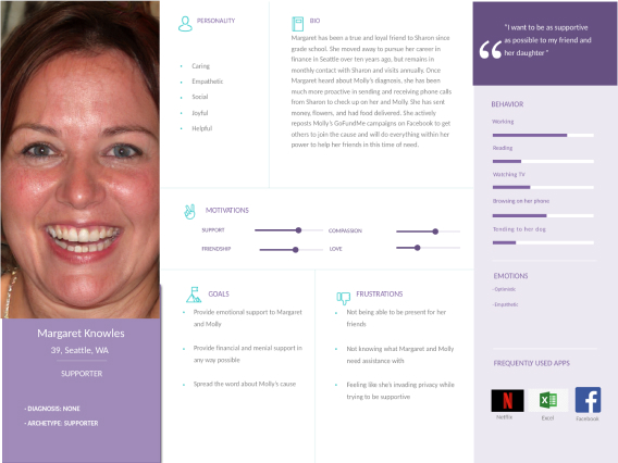
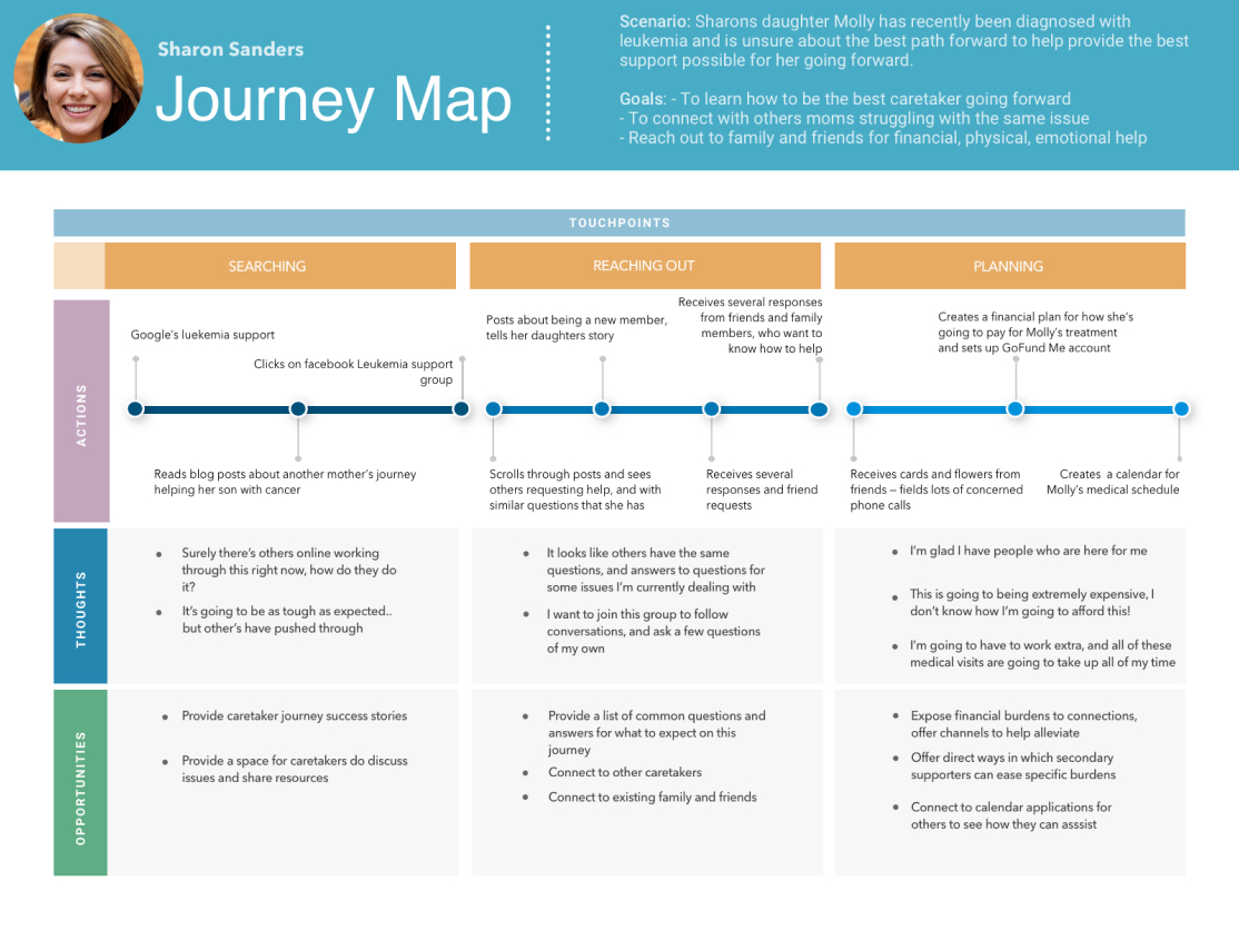
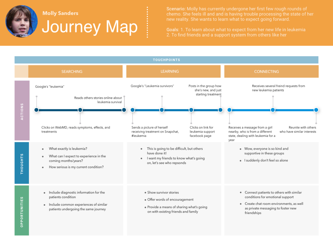
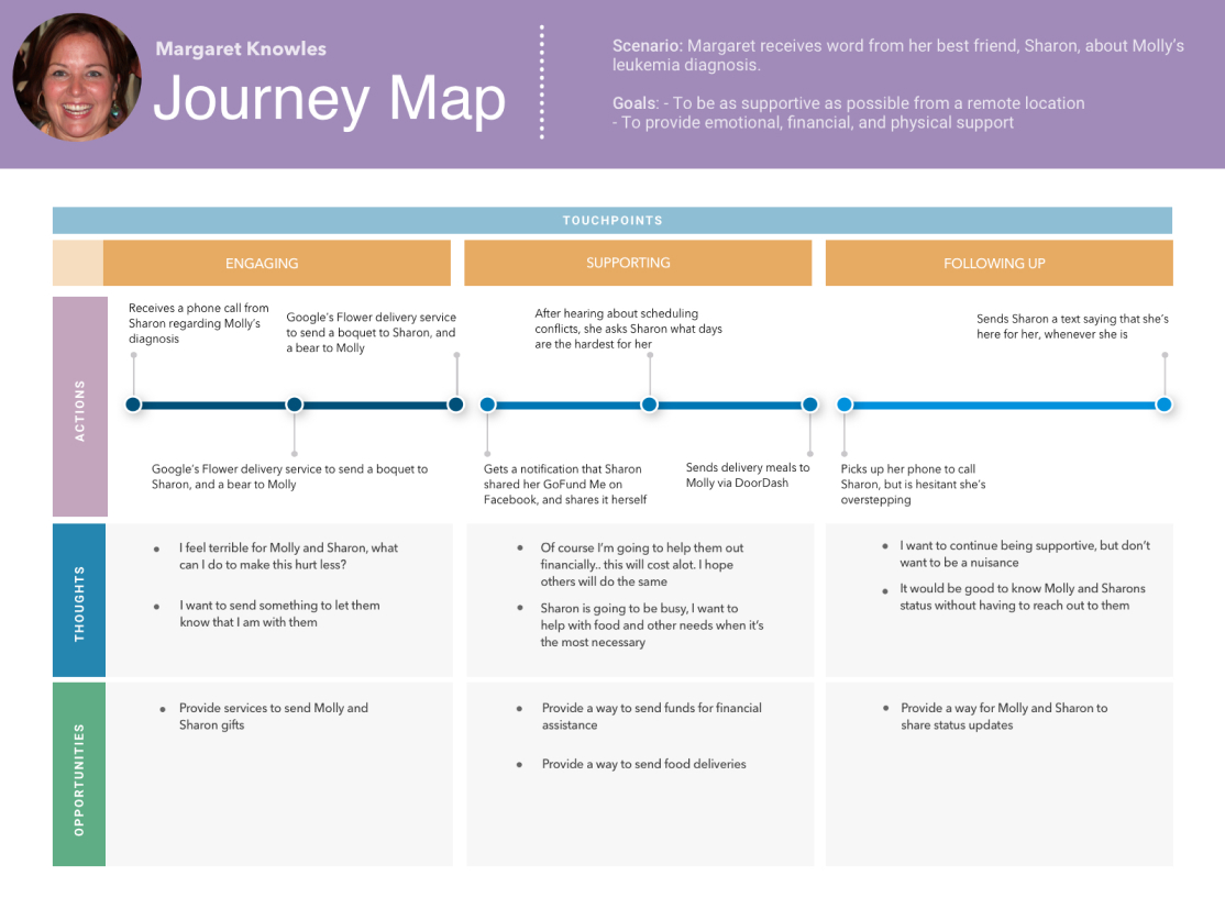
Once those trends were solid, I compiled personas — the key actors in the care story — so the team stayed clear on exactly who we were solving for and why. I paired each with a journey map of what the typical care process looks like in the real world, which made the gaps in the existing, painful process impossible to ignore.
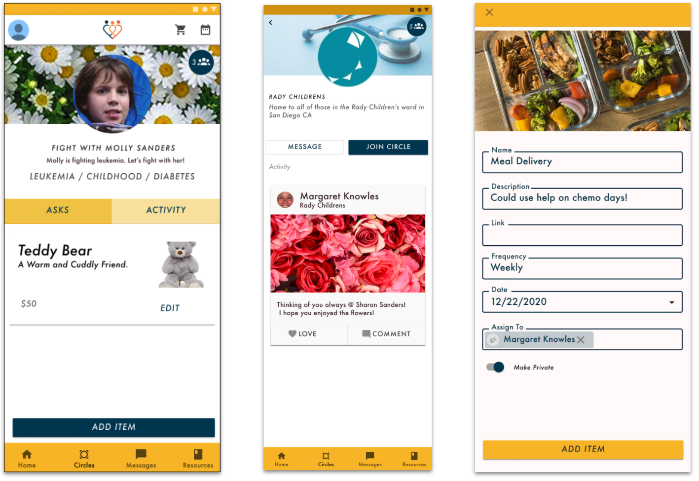
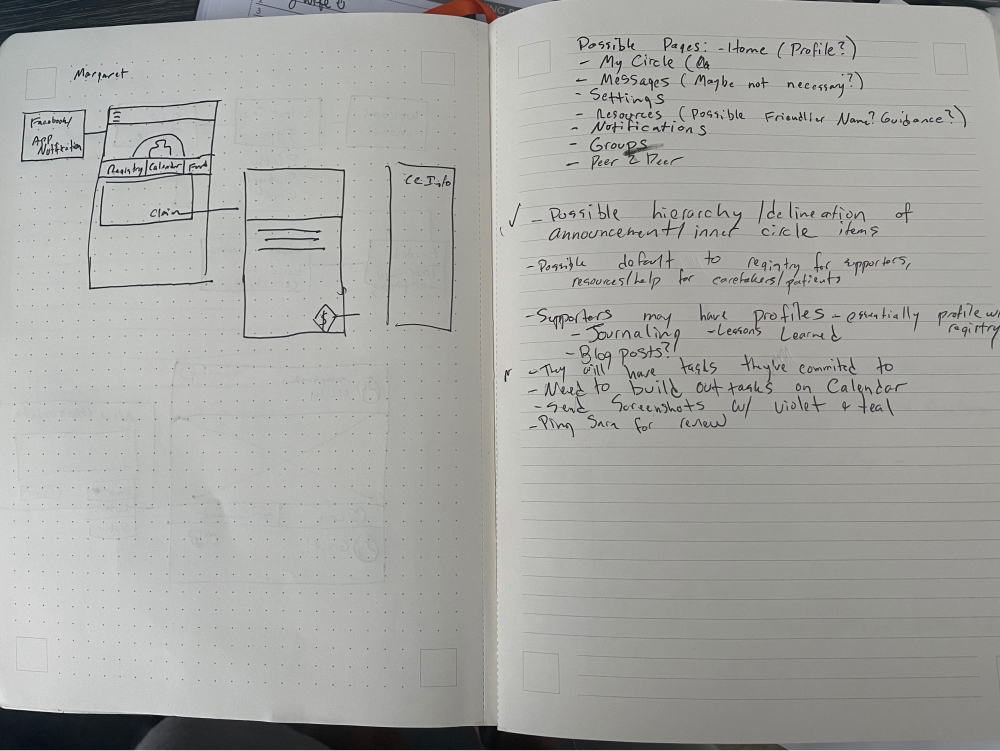
I grouped the key problems surfaced in those early conversations and ran a competitive analysis of what existing products already offered. From that, I built the information architecture — structured around the realities the research had revealed, like keeping care private to an inner circle by default rather than broadcasting it.
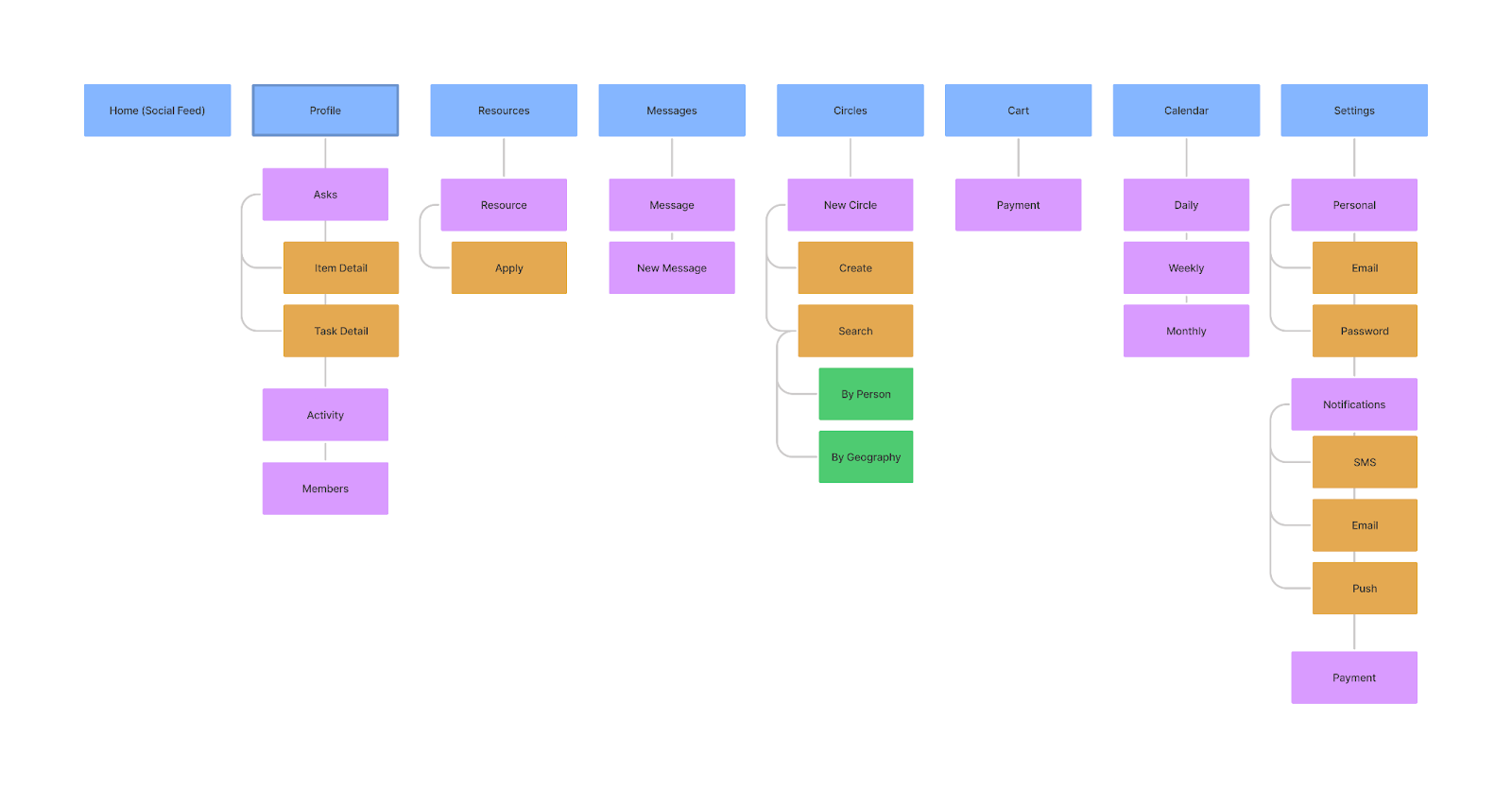
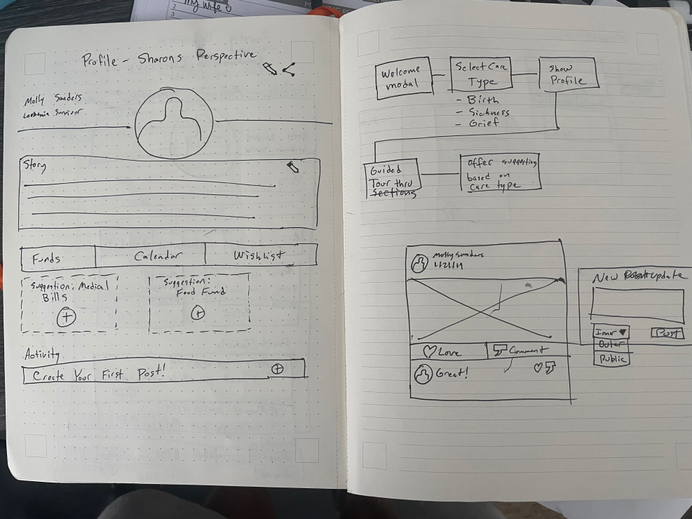
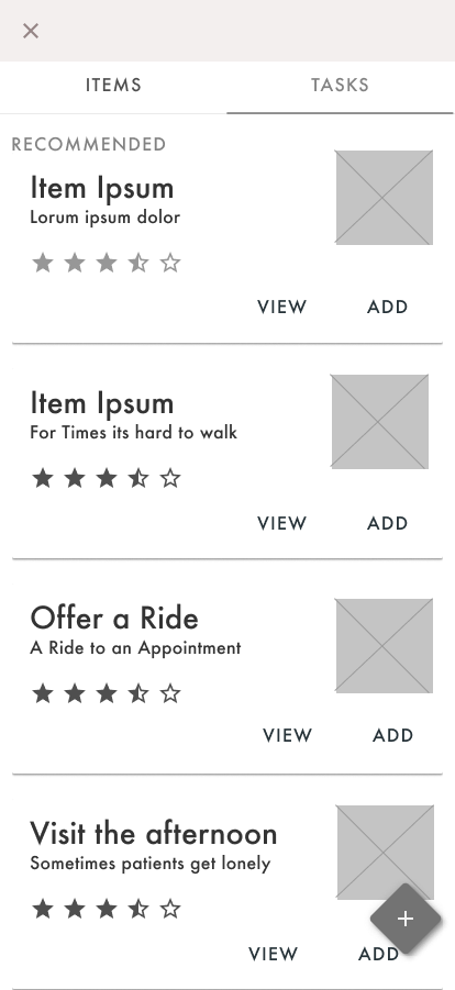
I ran several whiteboard sessions with business leaders and developers to keep three things true at once: we were solving the users' problems, addressing the key business need of selling care products, and building something feasible for a small dev team on a tight timeline. Wireframes let us quickly suss out internal problems with my hypothesized flows before they got expensive.
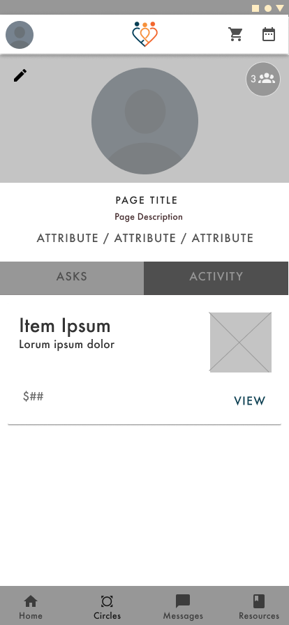
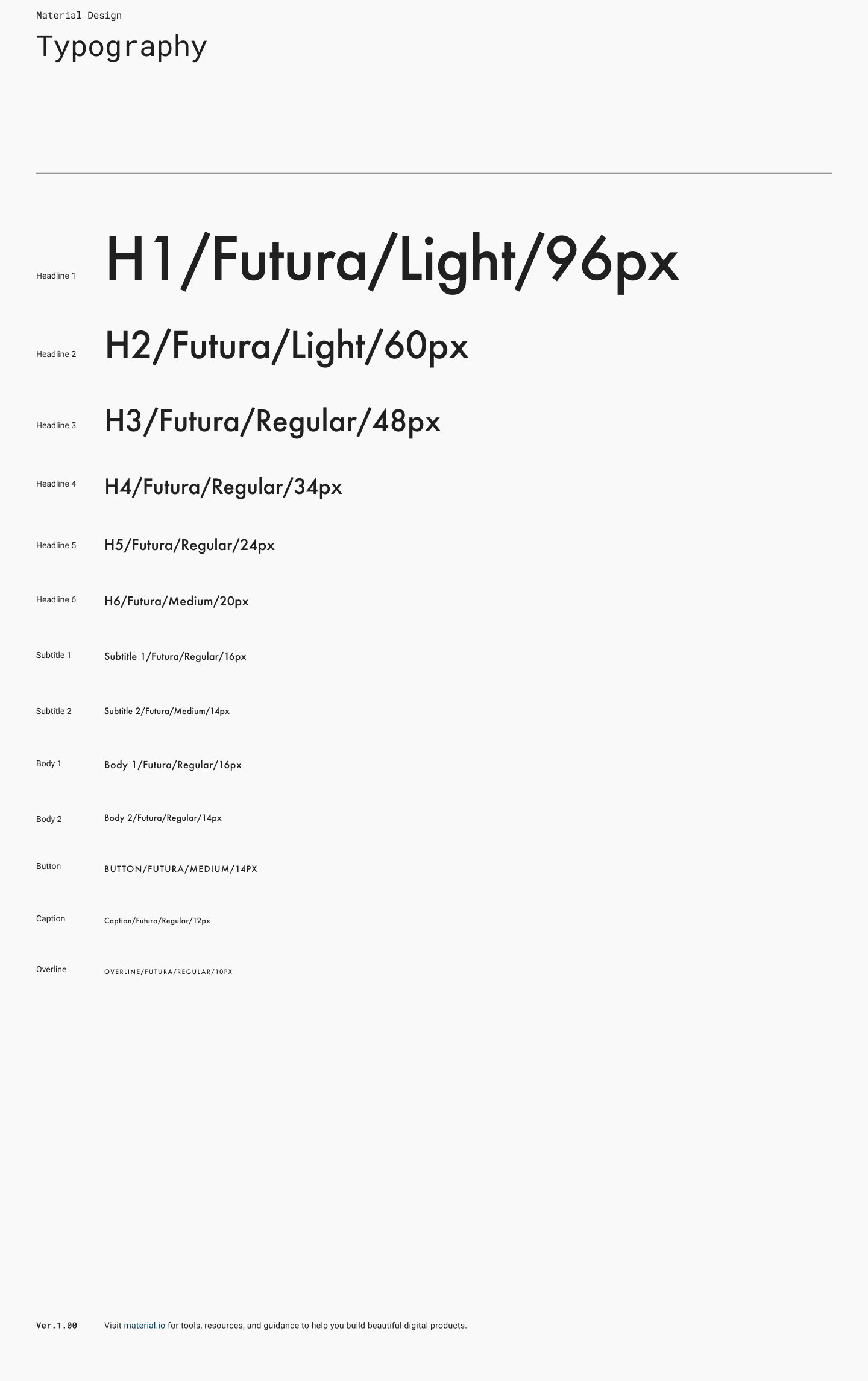
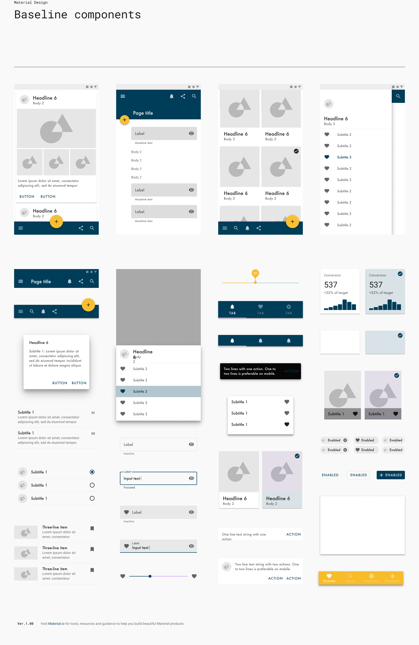
For type I went with Futura and Futura Book — a professional-yet-friendly balance that fit the mood of the app. The color palette came out of a mood-board session: the tone we kept landing on was "bright" and "calm," so I built an orange/navy complementary scheme out of the idea of a sunset over the ocean, which evoked exactly that feeling. From there I created components and tested and adjusted each one for contrast and accessibility.
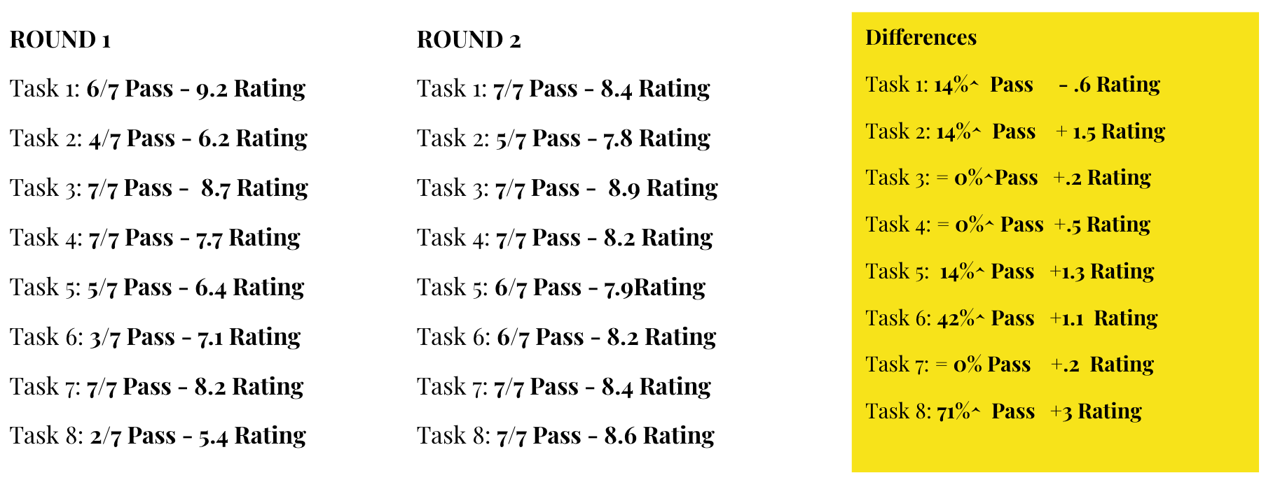
Next the veneer went on: I built the prototype, then confirmed and tested it. We defined 8 core tasks a user had to be able to complete to use the app successfully and hit the business objectives. I ran those flows through 2 rounds of testing across 7 users, watching pass/fail rates and capturing qualitative data. Testing did exactly what it's supposed to — it embarrassed a few of my assumptions early.