Consumer · The Control Group · 2014 · Lead UX Designer / Developer
Instant Checkmate is a high-traffic, web-based background-check service. As the sole lead designer, I ran the research the company had never done — 100+ user interviews, four personas, card sorts and prototype testing — and turned it into a redesign that lifted conversion over 40% while measurably cutting support calls.
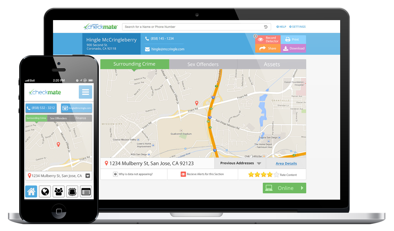
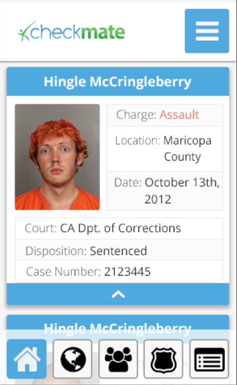
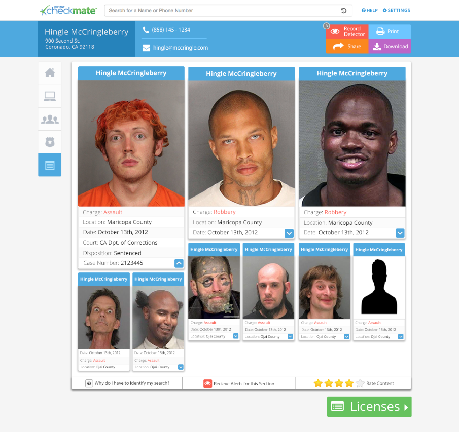
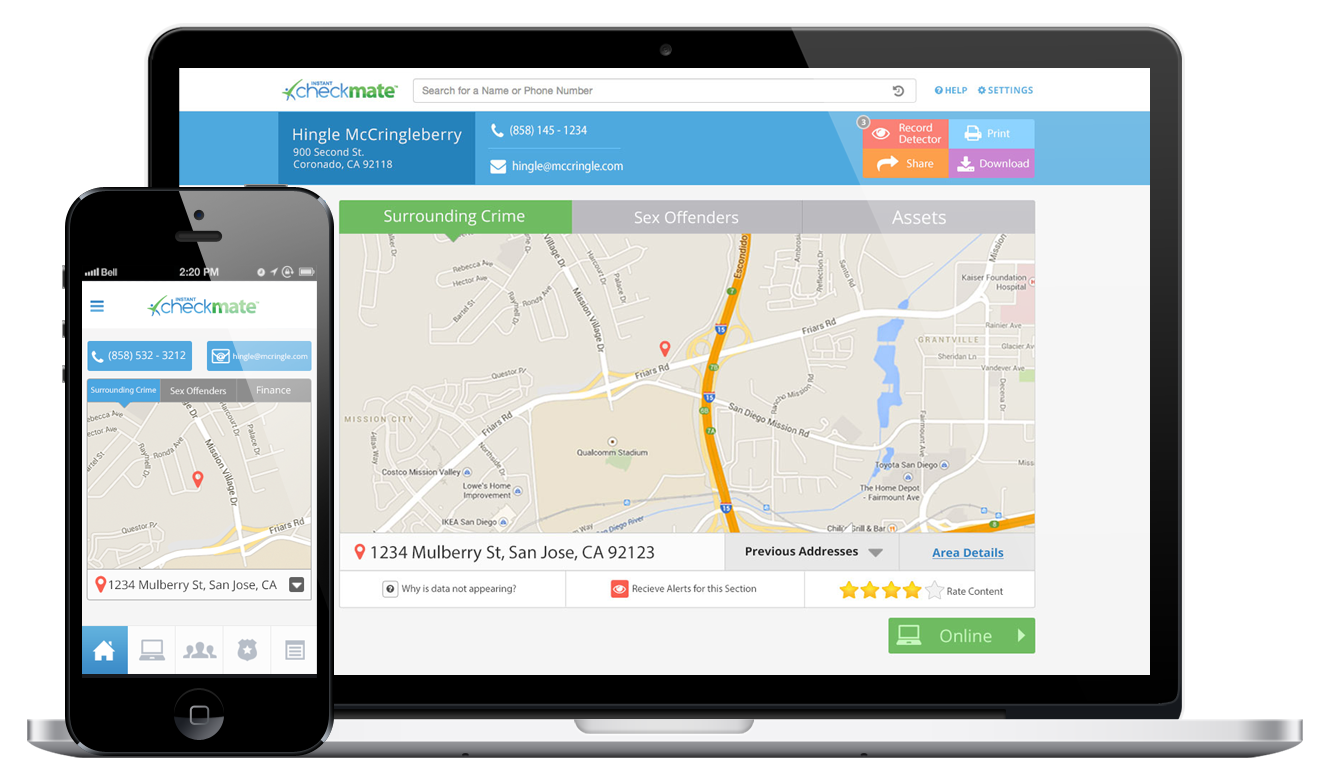
Instant Checkmate lets anyone search for a person and surface public records — arrest history and other flags. The product had thousands of users and real traffic, but the only lens the company had on those users was analytics. That left a void: who were they, what did they actually want, and what was stopping them from getting it? The team was struggling to find new ways to acquire and retain customers.
I came in as the sole lead designer, working with a lead developer and the COO. The business objective was direct — drive more visitors to purchase a full background report. My goal was the human version of the same thing: make a background check something people could navigate with ease. I owned the research and design end to end, and we agreed up front to judge the work the only honest way — by conversion, measured through A/B testing, and by support-call volume.
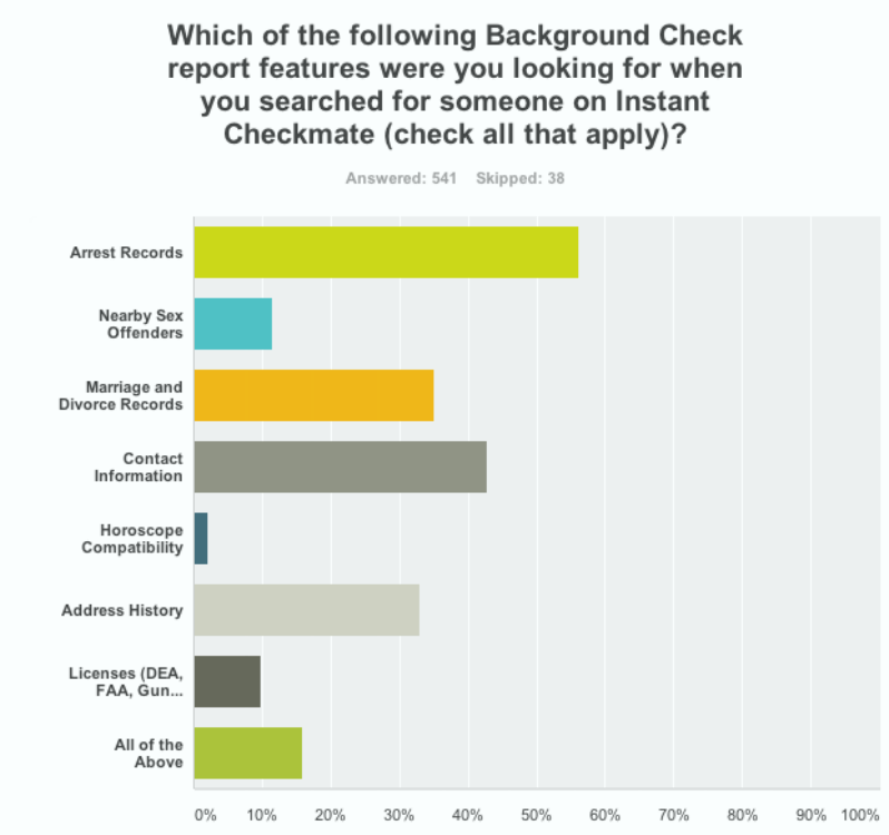
Before designing anything, I needed a high-level picture of who was actually showing up. I partnered with someone on the email-marketing team to send a SurveyMonkey blast to our registered customers, which gave me a first read on demographics and motivations — the kind of context analytics alone could never provide.
Then I went deeper. I put a screener on the site's home page offering a gift card to anyone willing to talk with me. As people signed up, I called them right away and ran a screen-recorded, think-aloud session, walking through their real experience of the product. Between the survey reach and these deep sessions, the work was grounded in 100+ user interviews — enough volume to see patterns, not just anecdotes.
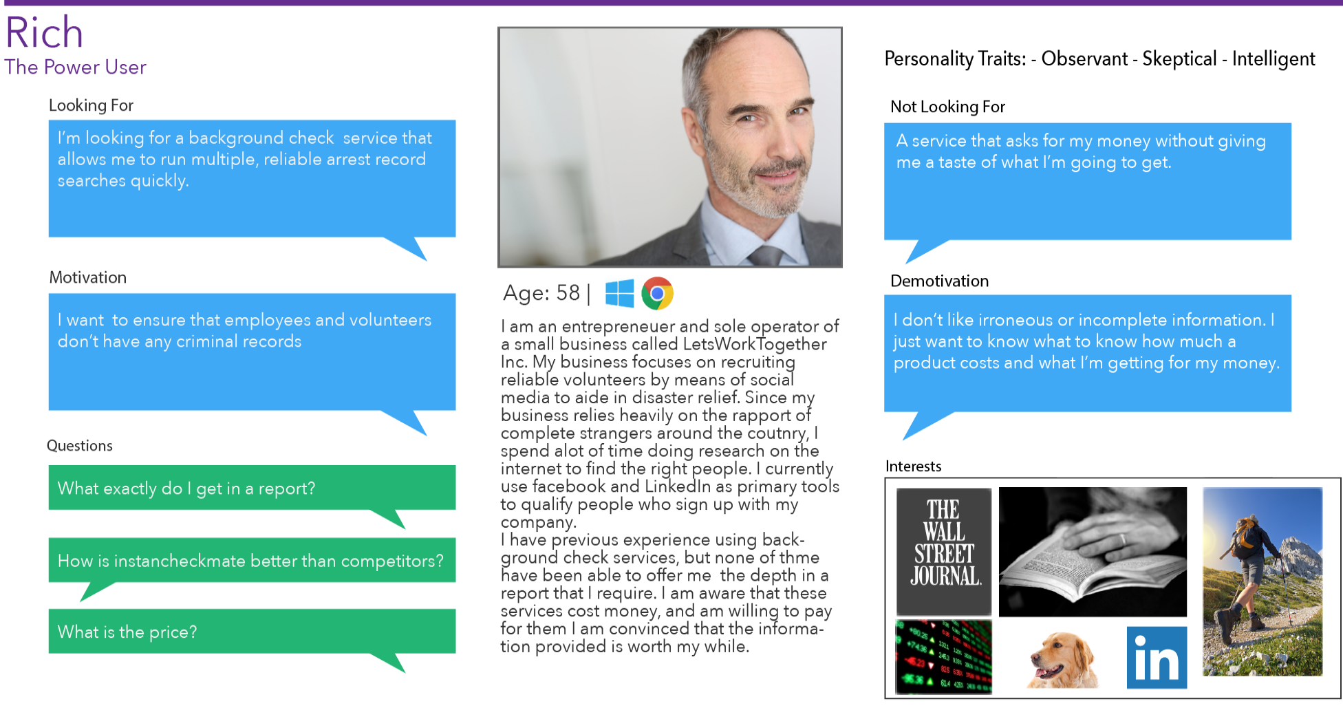
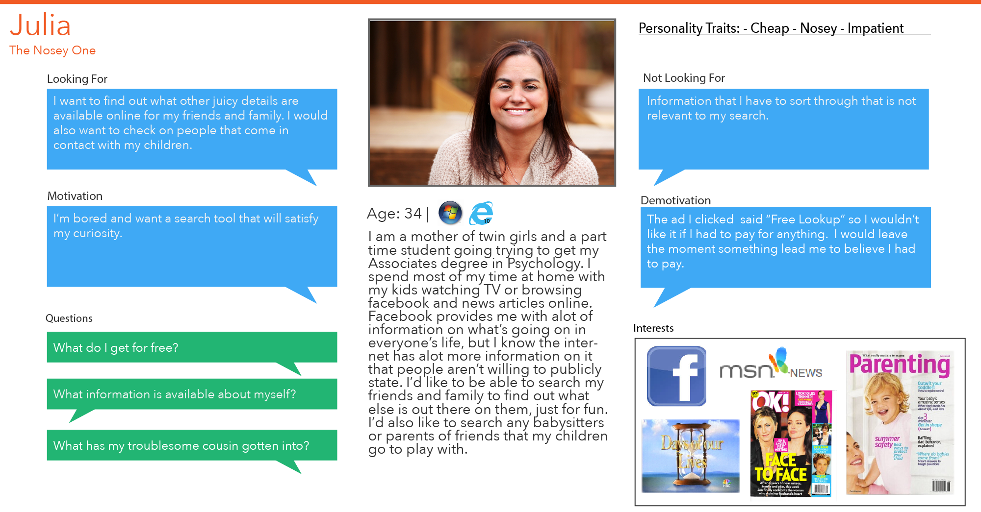
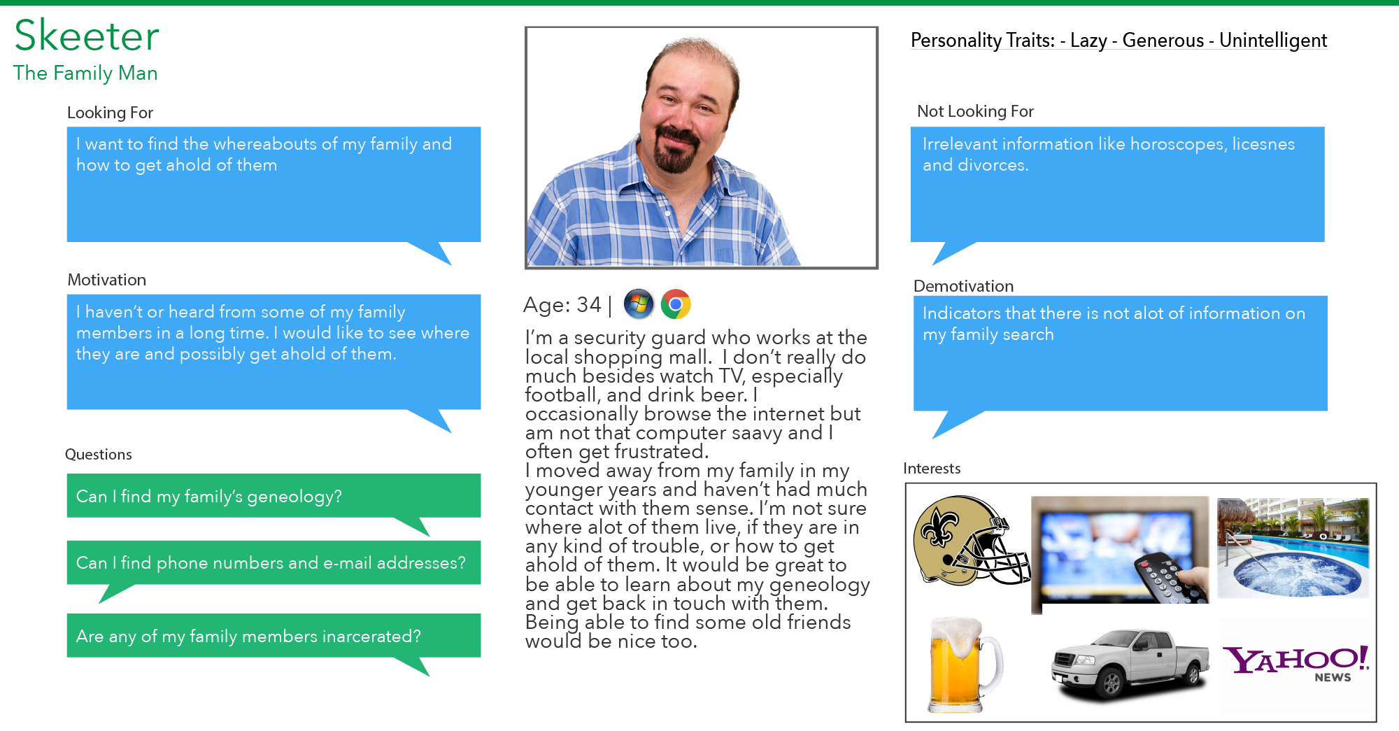
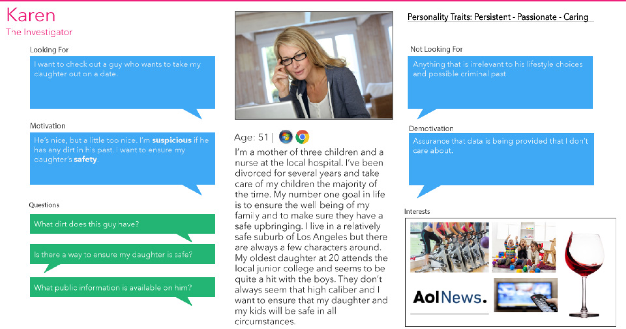
After identifying the trends in user goals and pains, I built four personas to represent the people using the site and their key motivations for wanting a background check. Four people, four reasons — they gave the team a shared, human reference point for every decision that followed.
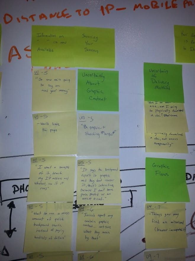
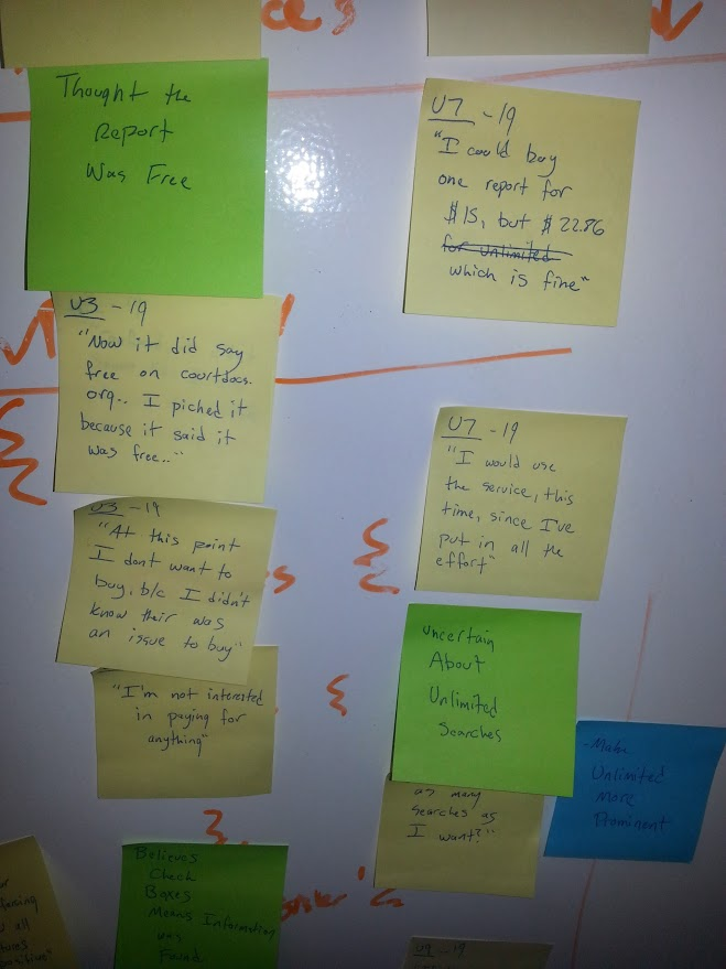
I transcribed every comment, observation, and idea from the sessions onto sticky notes, then hosted a week-long run of affinity-diagramming sessions to build what we called "the wall." Bringing developers and business leaders in to physically sort user data made the process more democratic — and let people who'd never sat with research build real empathy. From the groupings, I ran a trend analysis that pointed to the key needs and pain points.
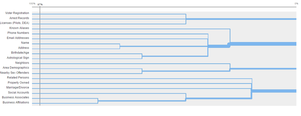
To get the structure right, I recruited more live users for a virtual card-sort study. There was bunk data to filter, but the volume produced clear, logical groupings for the existing content — and those became the backbone of the new information architecture.
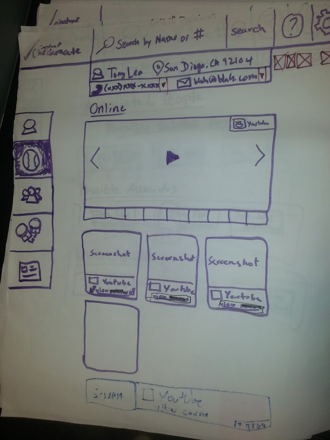
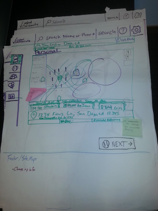
Plenty of trees were sacrificed getting this to a state I liked. I sketched ideas alongside the developers and the COO to stay inside development constraints while hitting the points the business needed to land. Then I digitized those sketches into low-fidelity wireframes and prototypes — and prototyped early specifically so I could test with users before committing.
That early testing paid off. Compiling the results into a spreadsheet surfaced bottlenecks I'd never have caught from sketches alone:
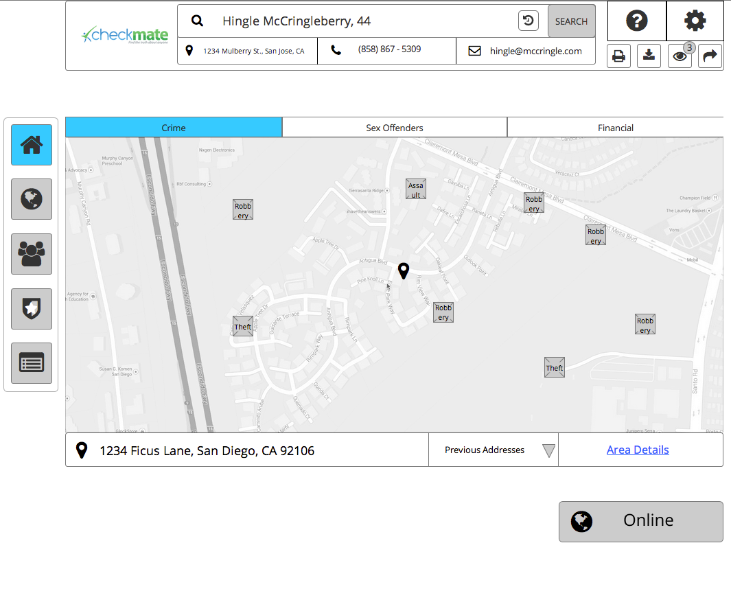
With the structure validated, I added the aesthetic layer to draw attention to the interactions that mattered. Then I ran another round of think-aloud testing, letting users move through the site for their real purpose. A couple of useful signals came back:
The design proposals were phased in and rigorously A/B tested rather than shipped all at once. The result was a conversion-rate increase of over 40% — which, at this scale, drove a substantial revenue lift for the business. Follow-up user tests confirmed a clear drop in frustration, and the support call center reported a significant decrease in phone calls and negative reviews.
Phasing the changes in and A/B testing each one is what let us prove the lift was the design — not luck.