Enterprise UX · Director of UX
Director of UX for a global supply-chain compliance SaaS serving Fortune 500 manufacturers. I led a research-driven redesign that lifted our satisfaction score from 6.2 to 8.6 — and built the company's first design team and design system along the way.
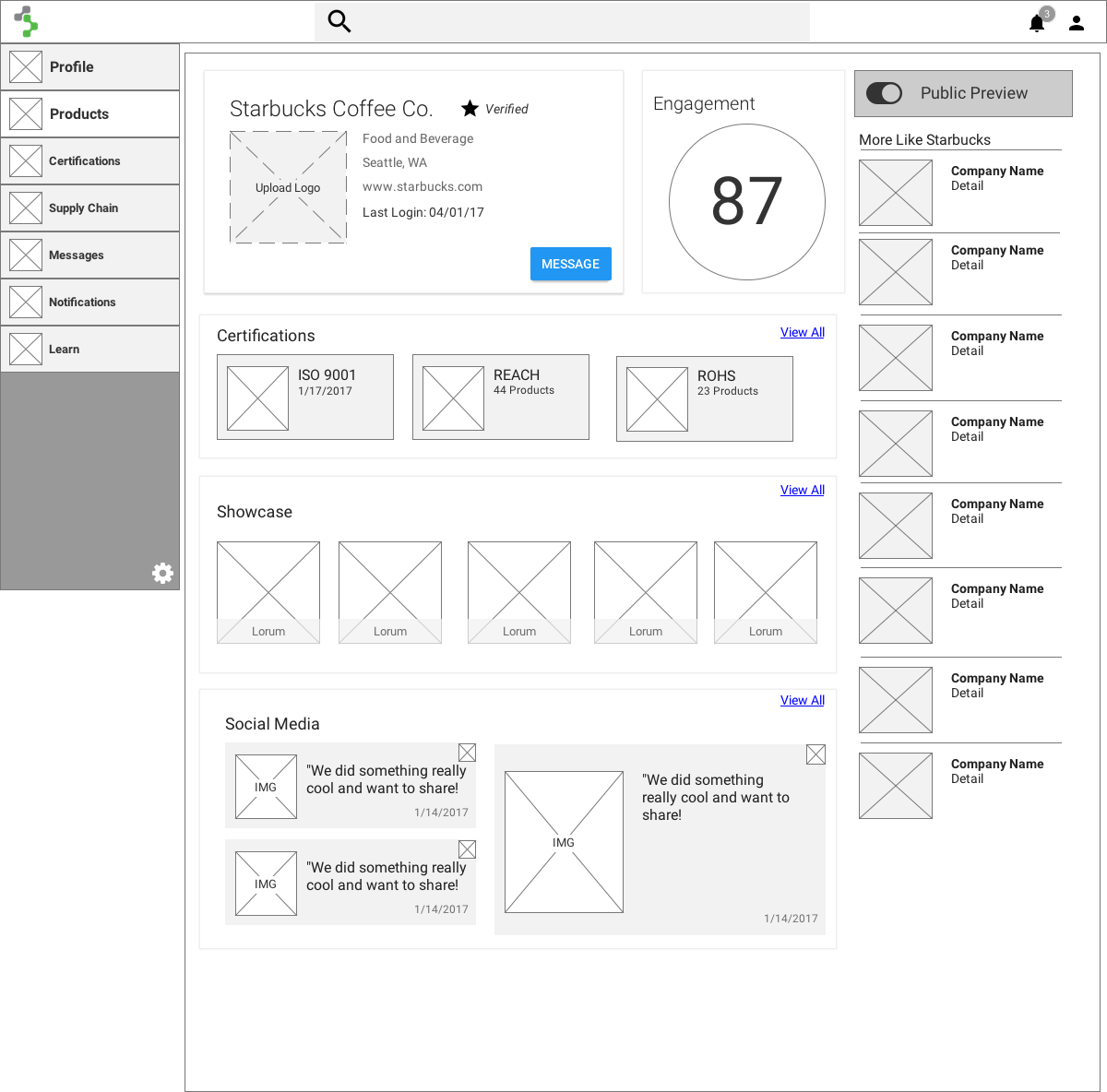
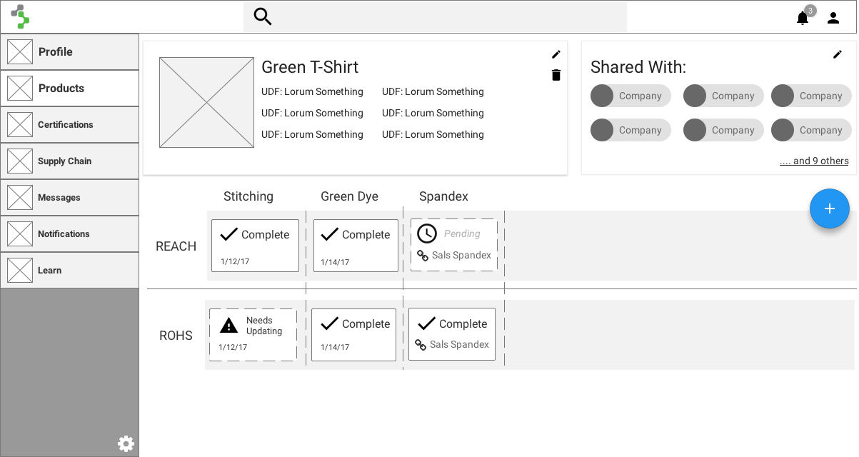
Source Intelligence is a supply-chain compliance portal that helps companies collect and analyze information on domestic and international regulations — a domain dense with data entry, edge cases, and high stakes. The product worked, but every workflow leaked friction, and the business wanted growth. The goal I was handed was concrete: raise customer satisfaction by re-imagining the experience, with the satisfaction score as the scoreboard.
I owned it end to end — as the sole lead designer working alongside the CPO, a product manager, subject-matter experts, and our lead developer. Over time that role grew into Director of UX, where I also stood up the company's first design team — eventually three designers — and its first design system.
Before designing anything, I needed a real picture of who our users were, what they did day to day, and where it hurt. I started with a survey of the existing customer base to separate what worked from what didn't — and captured a baseline satisfaction score of 6.2. Plenty of room to move.
I followed that with 15 contextual inquiries over video call — talking to people who fit the demographic but weren't current users, so I could see their real-world processes without our product coloring the picture. I compiled the qualitative data and ran a virtual affinity diagram with the team, which surfaced the trends that shaped everything downstream.
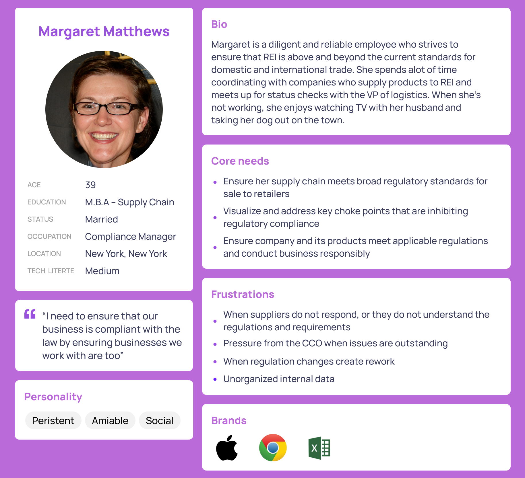
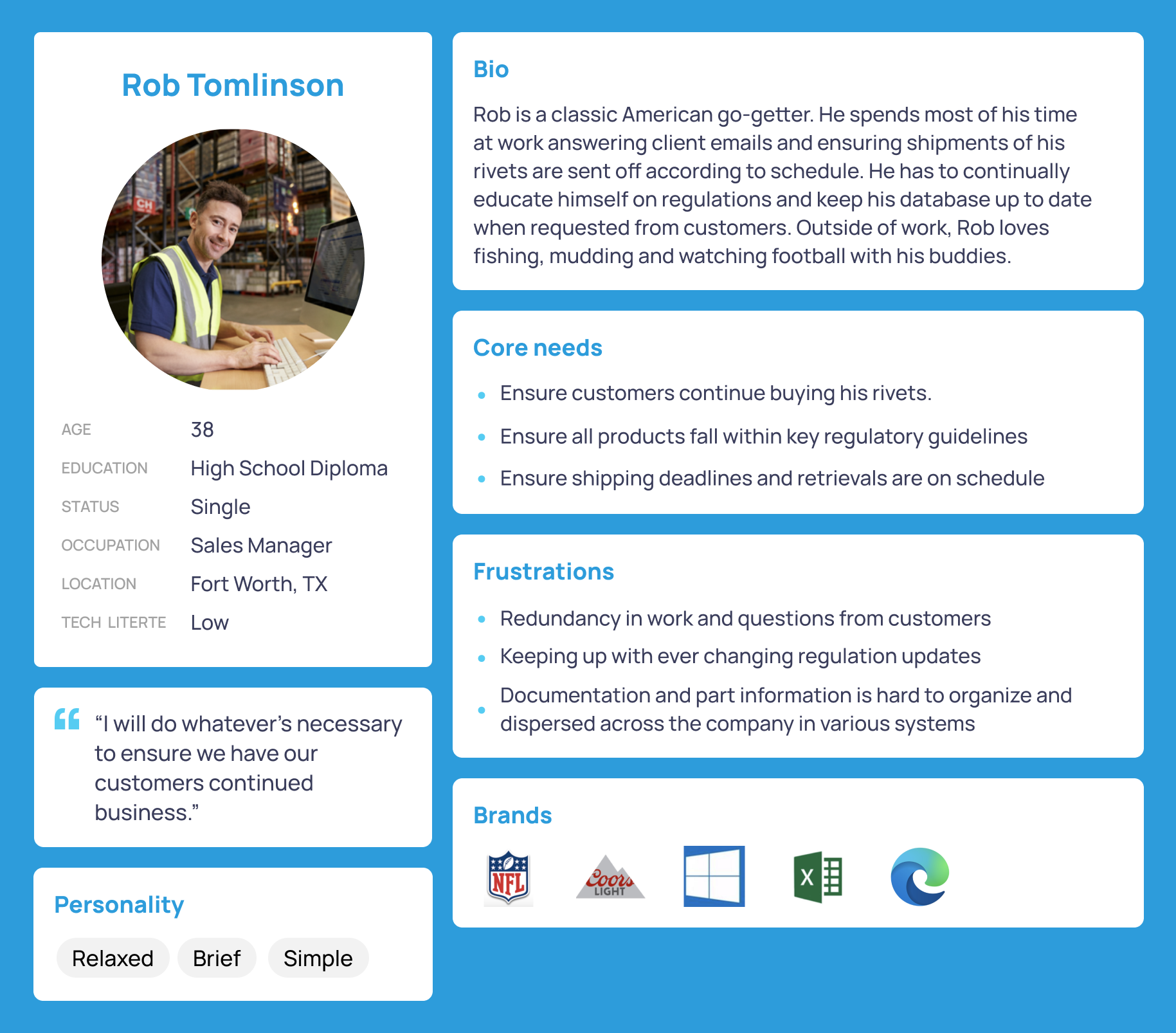
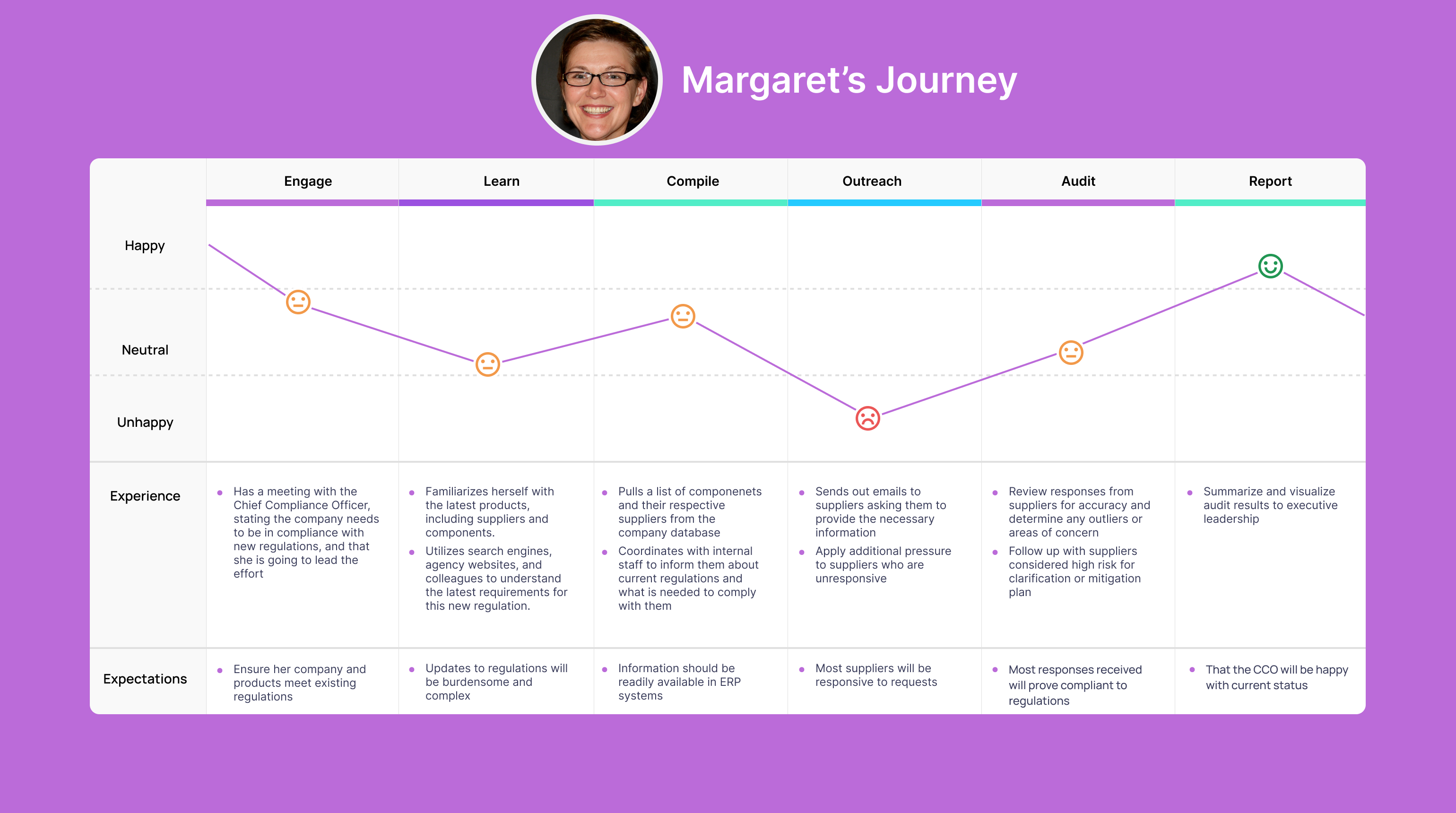
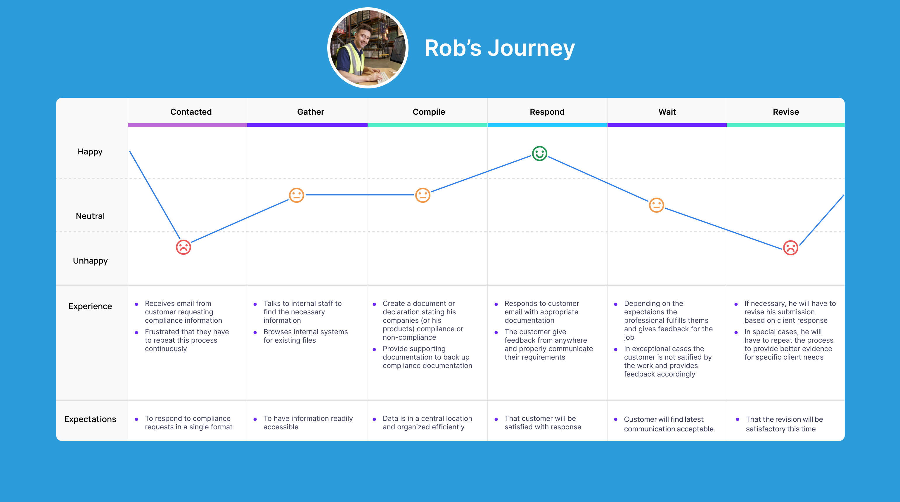
From the trends in user goals and pains, I built personas and journey maps to keep the team anchored on real people — what they were trying to accomplish, and exactly where the existing system got in their way.
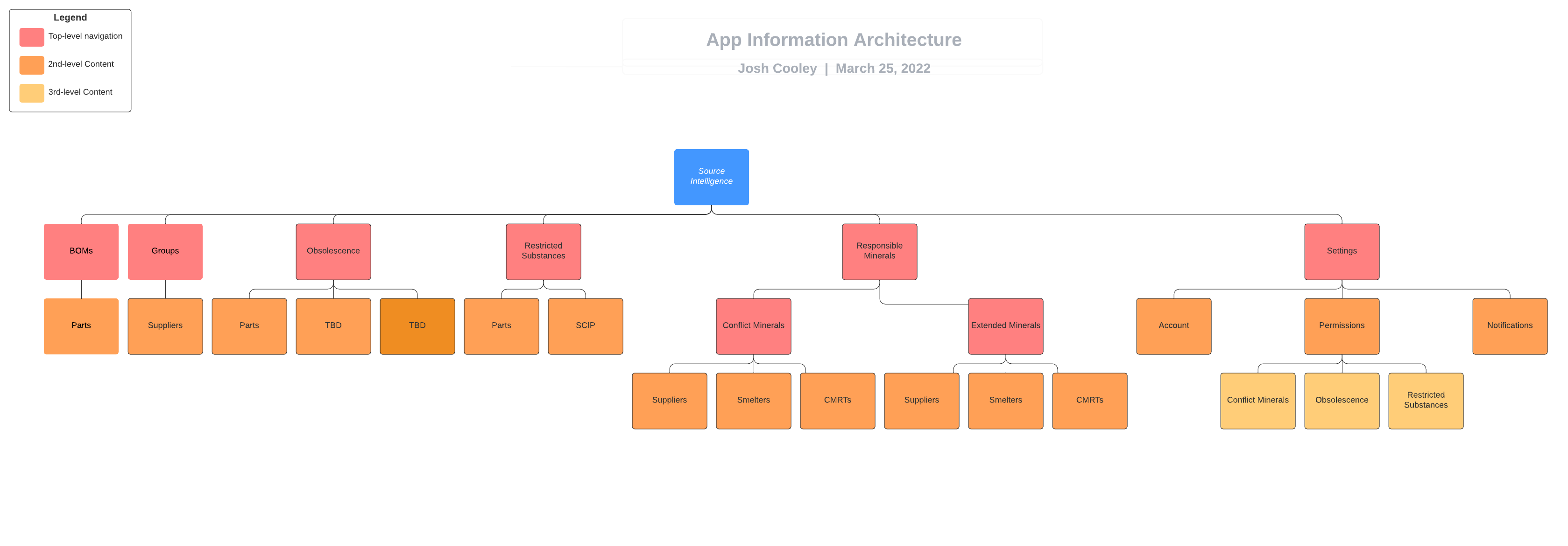
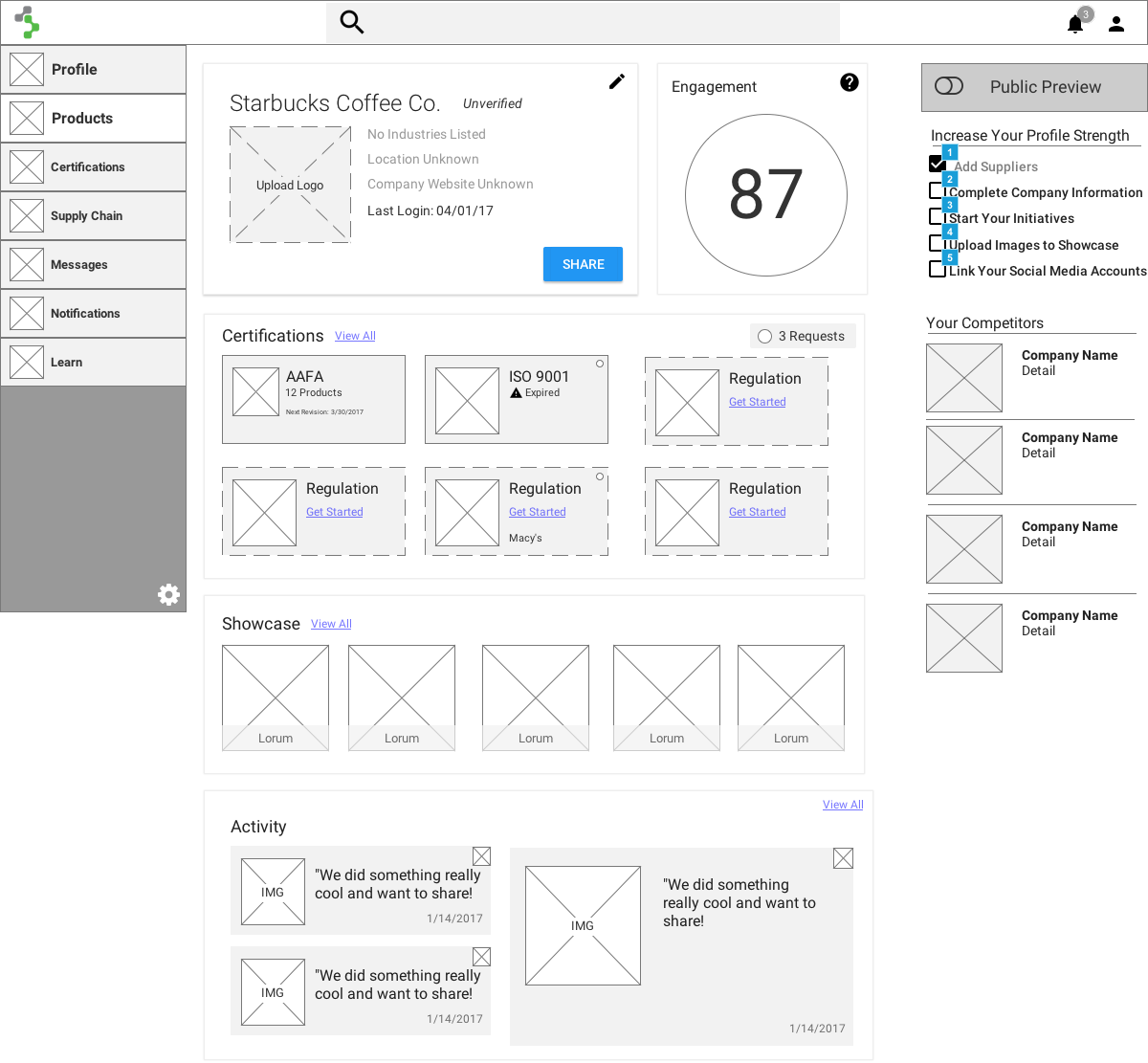
Using feedback on what worked in existing systems, I designed the initial information architecture, then iterated it across several rounds as testing taught us what mattered most. Wireframes and wireflows followed, discussed with two very different audiences.
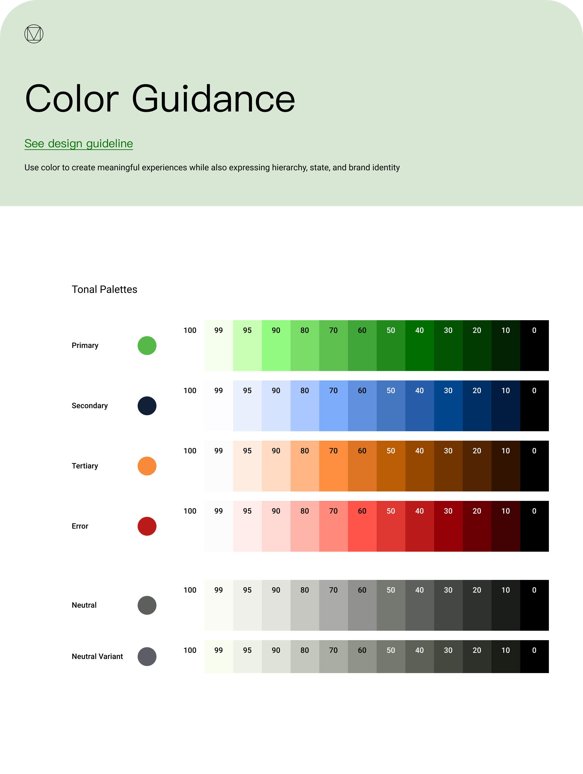
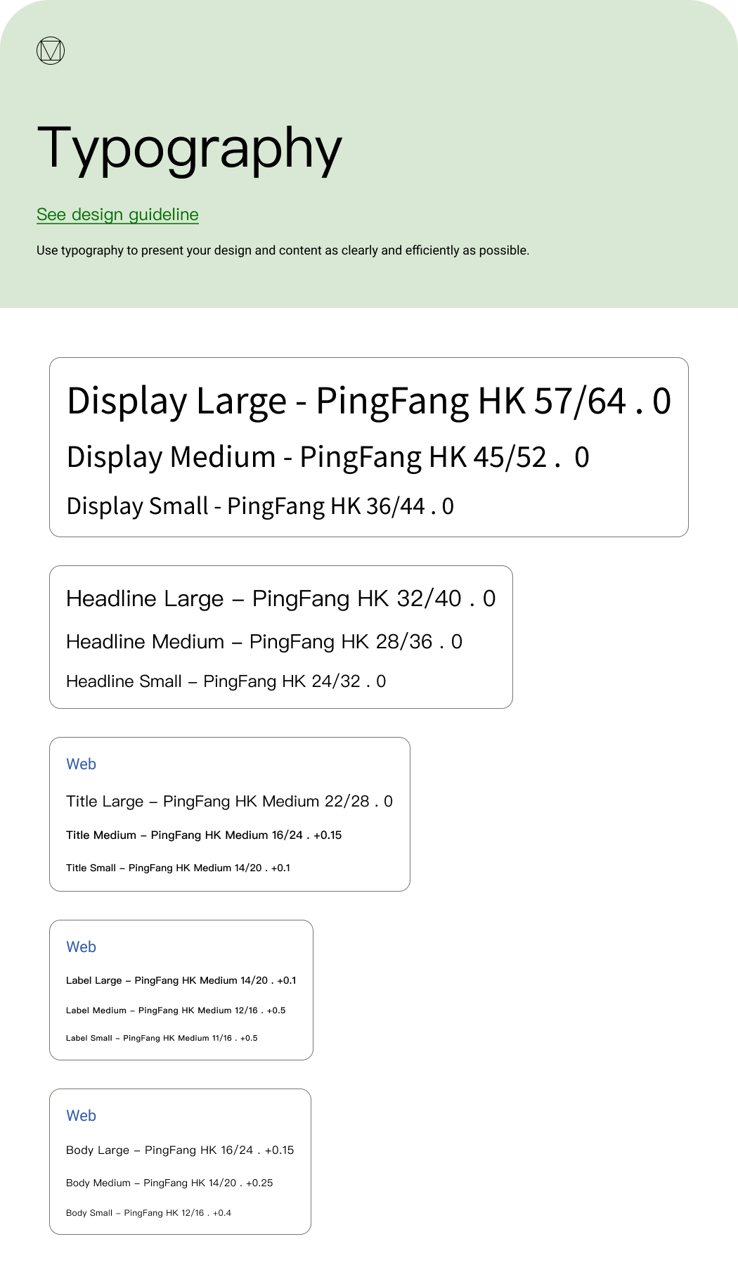
I built a style guide in congruence with our existing core colors, deriving the palette against Material Design standards and testing every selection for accessibility. I chose typography that read modern and professional — and, just as importantly, held up across languages, since many of our suppliers were based in China and other regions. This became the foundation of the company's first centralized design system and component library, built in partnership with Product and Engineering — and once it landed, it lifted development velocity by roughly 35%.
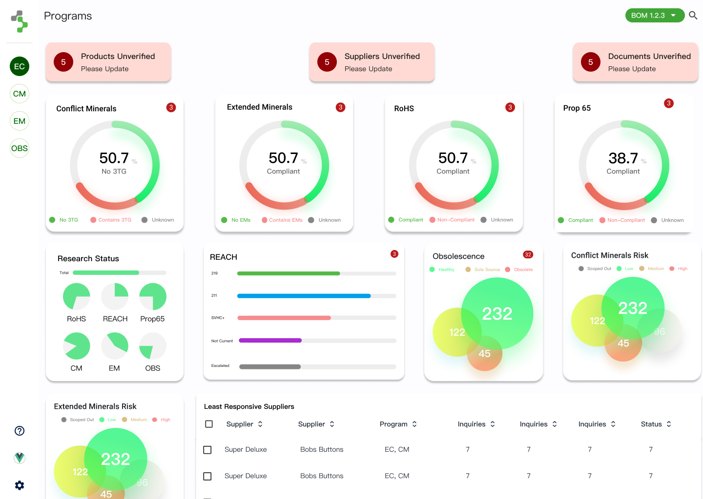
After the first major design change, the satisfaction score rose from 6.2 to 8.6. The redesigned data-entry workflows — the screens customers lived in — cut user error by roughly 40%, and sales saw a real boost too. Many factors drive a sales number, but the redesign was credited internally as one of the major reasons.
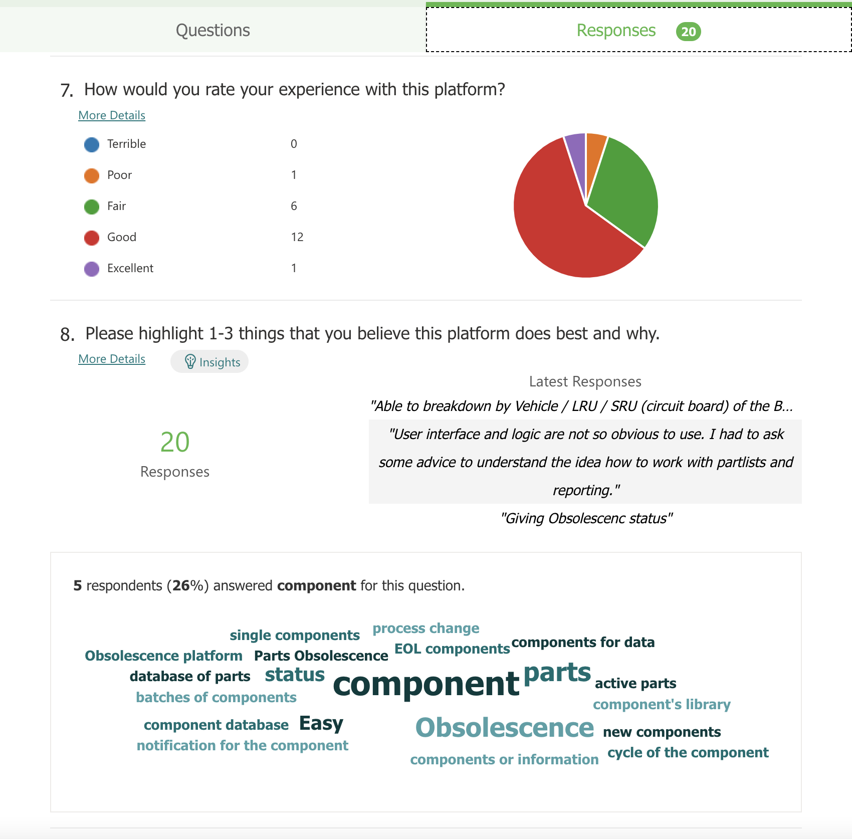
I didn't treat launch as the finish line. We instrumented the app with heatmapping and analytics to see what was actually used and how often. I put a live, rotating satisfaction survey in place so I could line satisfaction up against specific releases, and worked with client success to stack-rank and address the themes coming back from customers. I kept making my own modifications in the code to test design changes in the real product.
Once it's in the wild, aligning satisfaction to releases is the most honest way to keep iterating.